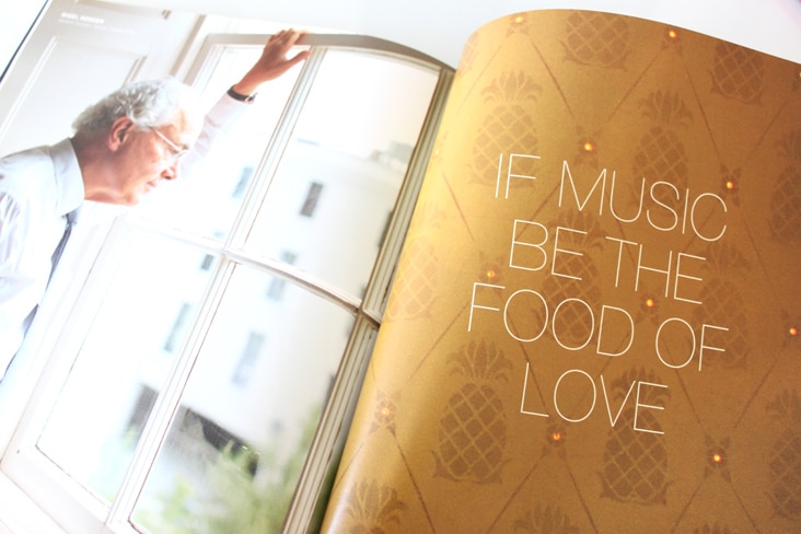
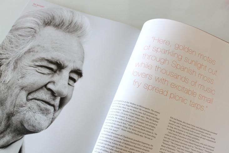
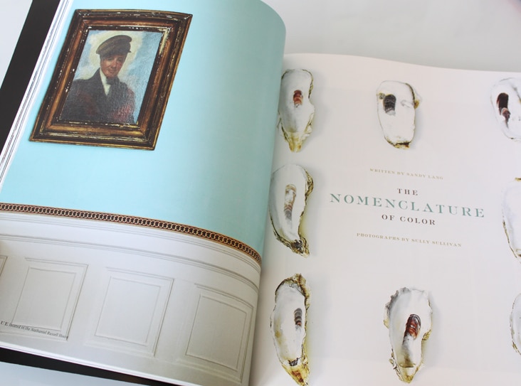
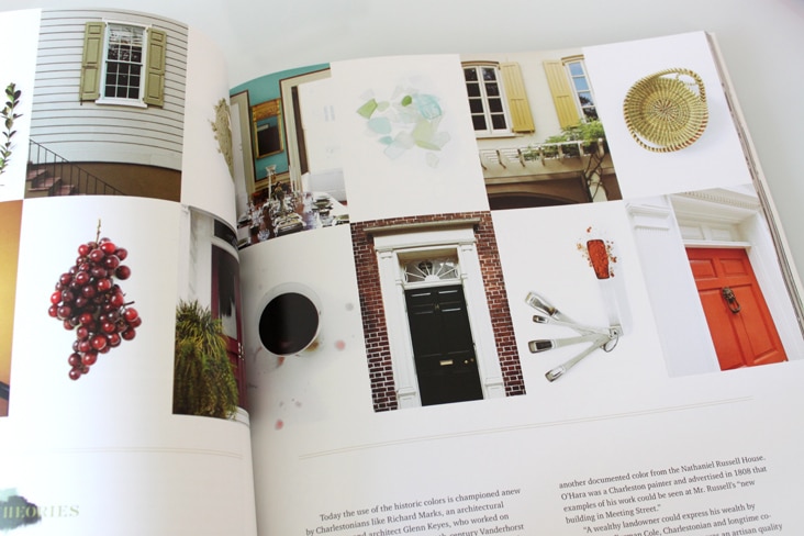
The 2012 issue of Legends Magazine is here! Volume 23 is, as always, full of beautiful photography and thoughtful writing. It was a pleasure to design and compile the entire magazine again this year. See last year’s issue here.
Archive for the ‘Blog’ Category
Eberjey Brand Update
March 9, 2012
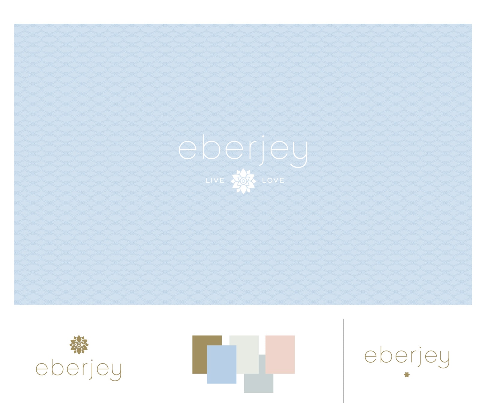
We’ve been long admirers of the company Eberjey, so when Ali and Mariela gave us a call to help them refresh their brand, we were thrilled. Ali and Mariela started Eberjey 1996 from the belief that the layer worn next to the heart should express happiness, love and confidence. We updated their logo while maintaining all of the elements that were and are truly Eberjey – the flower, simple typography and their iconic Eberjey blue. We also developed a color palette around their established blue along with graphic elements, patterns and a type family. The changes are subtle but make a big impact. Read the rest of this entry »
Client: Eberjey
Hampden and Rag & Bone
March 5, 2012
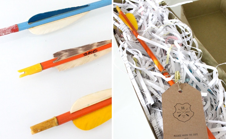
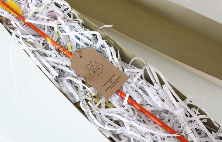
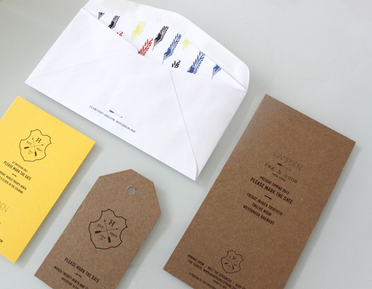
At the end of this month Hampden Clothing will present Rag & Bone’s Spring collection. Inspired by Rag & Bone and their latest colorful collection, we designed a simple kraft tag and attached it to a vintage wooden arrow to serve as the invitation. We love the brightly worn colors of the arrows in contrast to the natural kraft paper. Read the rest of this entry »
Client: Hampden Clothing
The Garden Summer
February 28, 2012
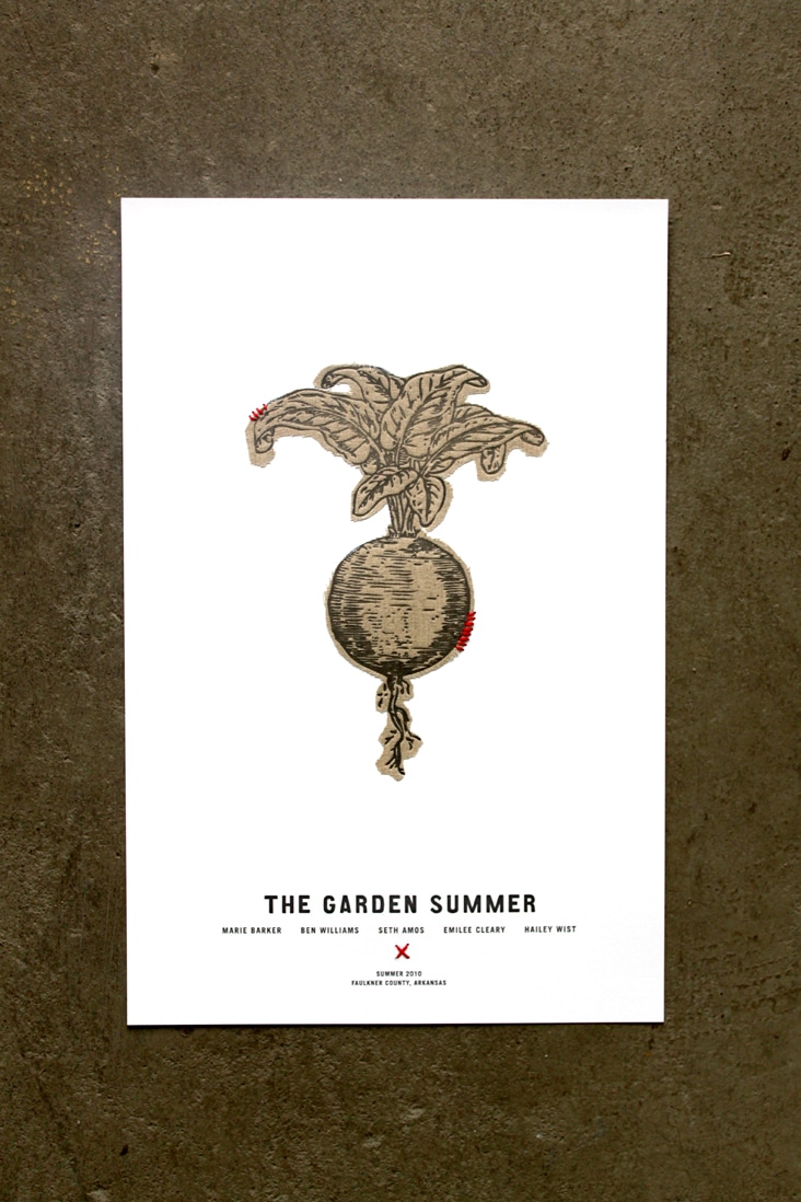
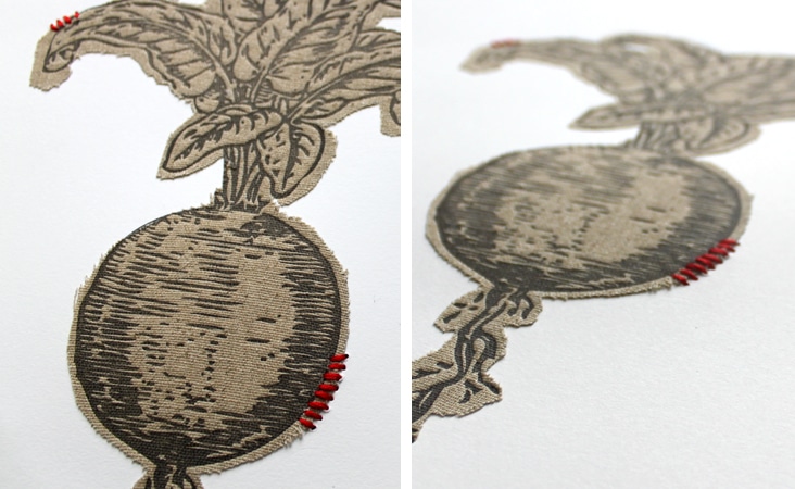
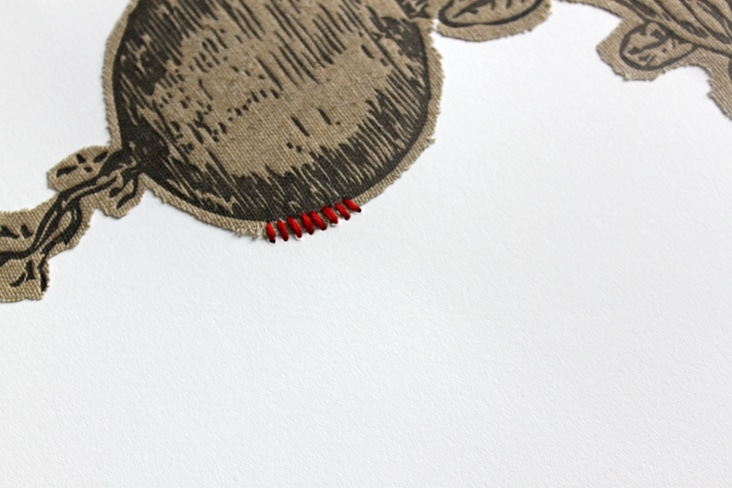
In the Summer of 2010, Hailey Wist invited four suburbanites to a ranch in rural Arkansas. They lived in a small cabin, grew a large garden, ate only from a 100-mile radius, sold at a local farmers market, and hosted a field feast. The Garden Summer project was a grassroots, community-based, social experiment. On February 9, 2012 the documentary they made of that summer premiered at The American Theater in Charleston. We designed these posters for the much anticipated event. The poster design and execution was a multi-step process. We cut fabric turnips that we then stitched to card stock and then letterpressed overtop of the fabric. It was a labor of love, but we’re so happy with the simplicity and dimension of the posters. And, we can’t forget to mention, the film was excellent! It will soon be traveling to a film festival near you and is a must see!
Client: Hailey Wist
Mural Design
February 19, 2012
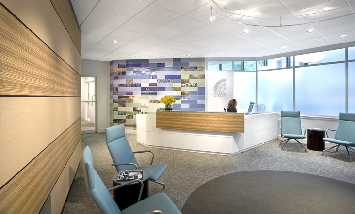
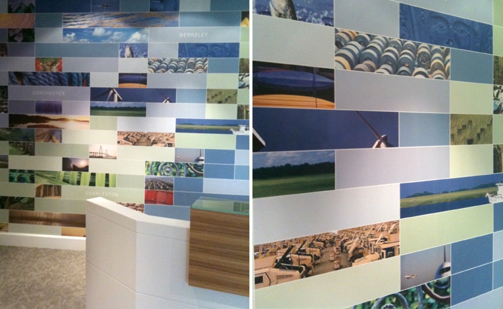
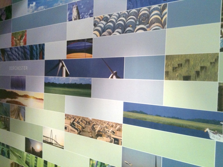
The Charleston Regional Development Alliance recently renovated their office space and came to us to design a graphic to fill a blank wall left at the end of the renovations. The wall directly behind the reception desk was in desperate need of some visual impact so we were excited to help. Our challenge was to design something that worked seamlessly with the interior architecture and that also served as a talking point and representation of the CRDA to visitors. Read the rest of this entry »
Client: Charleston Regional Development Alliance
Proud Mary Signage
February 13, 2012
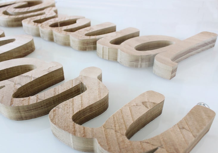
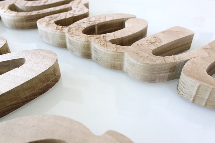
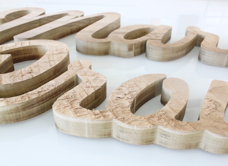
It was fun, as always, to work with Harper from Proud Mary on her new trade show signage. We used rough sawn natural wood and had it cut into the form of her logo. We love the simplicity of the natural wood in contrast to clean script of her logo. Read the rest of this entry »
Client: Proud Mary
Rewined Candles featured on CA and FPO
February 6, 2012
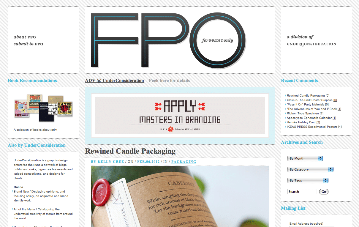
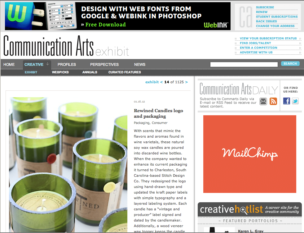
Excited to see Rewined Candles on Communication Arts Exhibit last week and now FPO this week. Congrats Rewined!
Client: Rewined Candles
Jessica Burke Photography
February 5, 2012
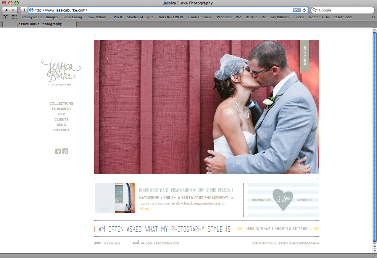
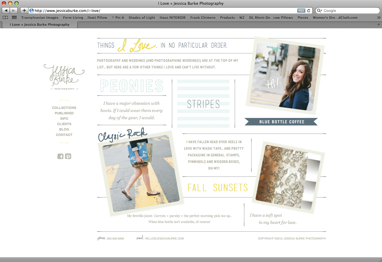
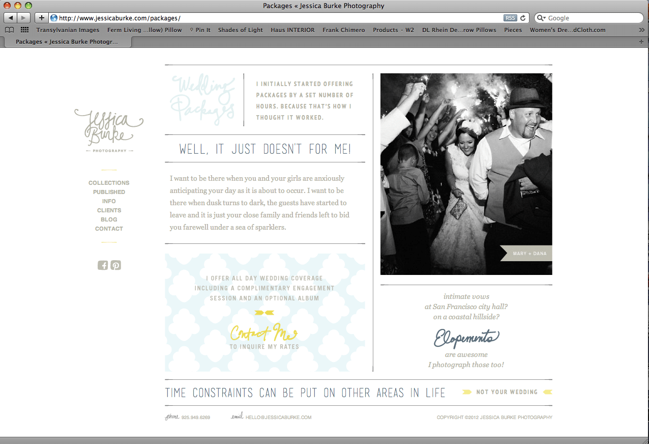
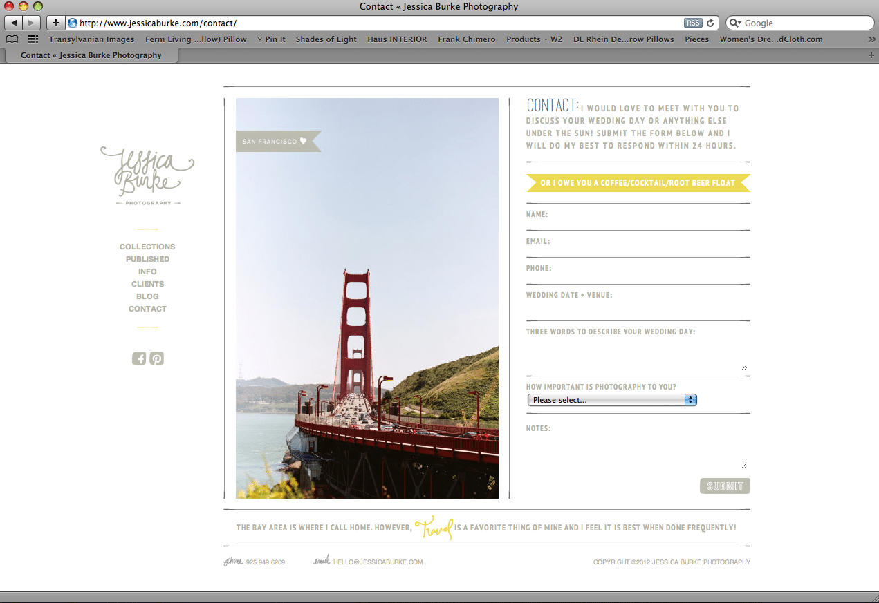
Over the past several months we’ve been working closely with Jessica Burke to rebrand her photography business. We designed her logo and have been busy applying her new brand to a variety of applications. Her website is the first of those applications to be complete. Jessica is a talented young photographer from San Francisco with a youthful, modern and unobtrusive style. We designed her website to reflect those qualities and showcase her beautiful work and fun personality.
Client: Jessica Burke
Gibbes Museum of Art – Jill Hooper
February 3, 2012
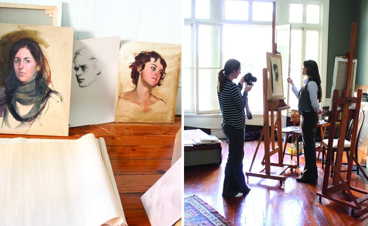
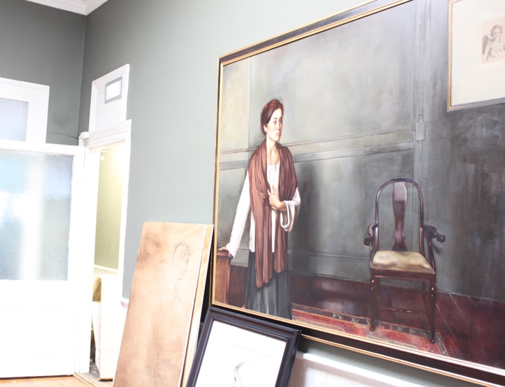
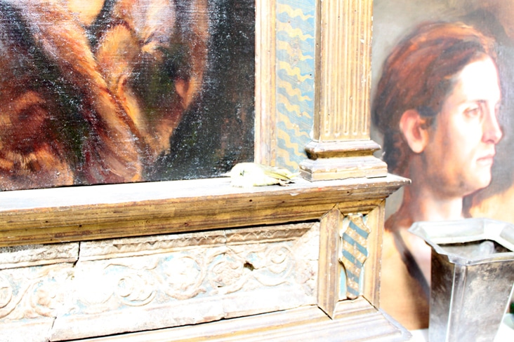
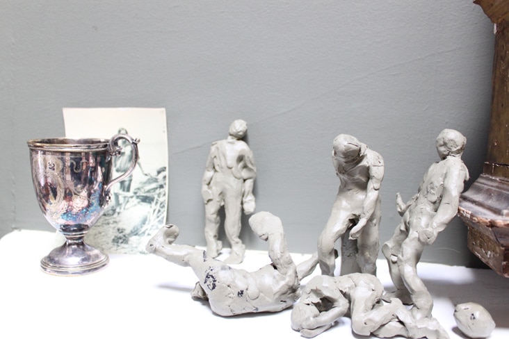
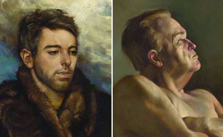
Jill Hooper is a classically-trained, realist painter whose beautiful portraits have earned international recognition. Stitch recently had the chance to visit with Jill at her studio in preparation for the design of the Gibbes’ Signature Magazine (of which she was on the cover). Her historic downtown studio space is filled with natural light and inspiring objects of all shapes and sizes. It was truly a treat to be able to see her process, studio and objects of inspiration of which she surrounds her self with. Read the rest of this entry »
Client: Gibbes Museum of Art
