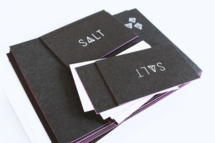
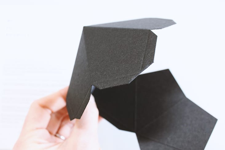
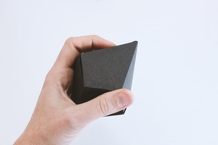
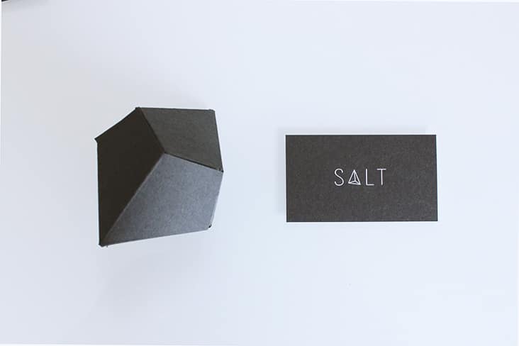
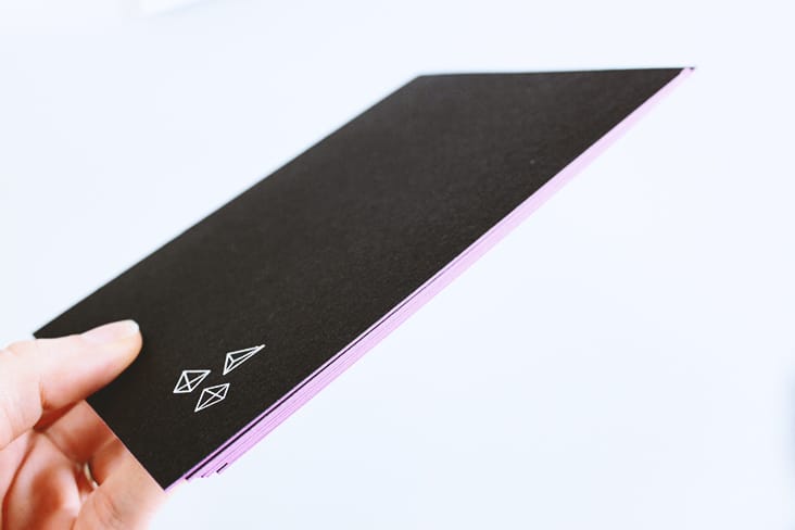
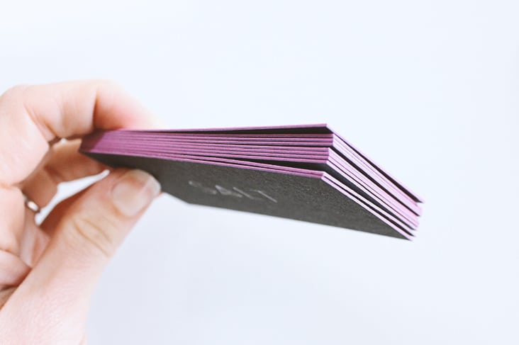
More new work to share from Salt & Co. Duplexed paper, foil stamp and edging along with die-cut, three dimensional crystals bring this re-brand to life.
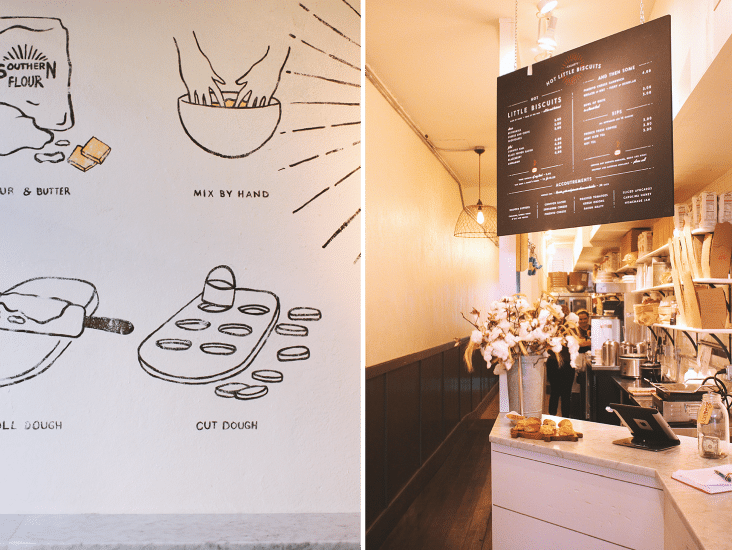
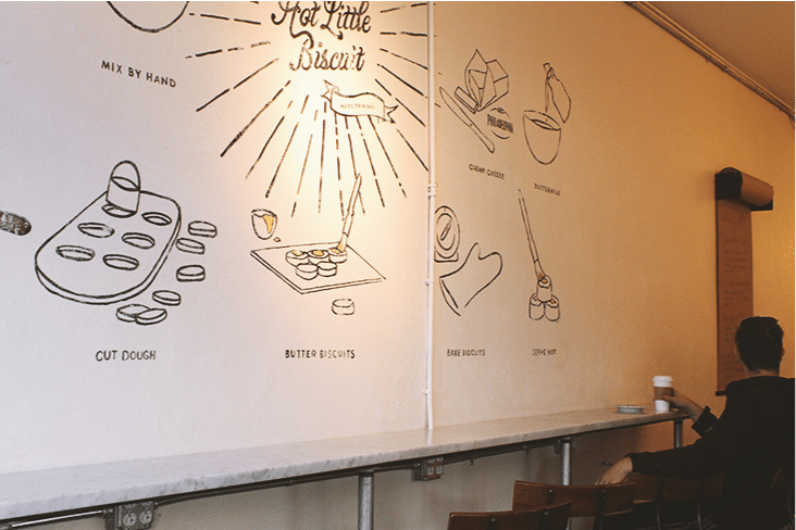
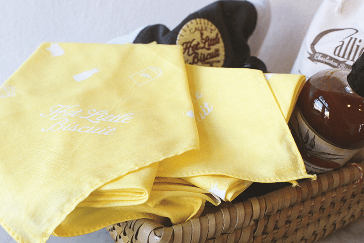
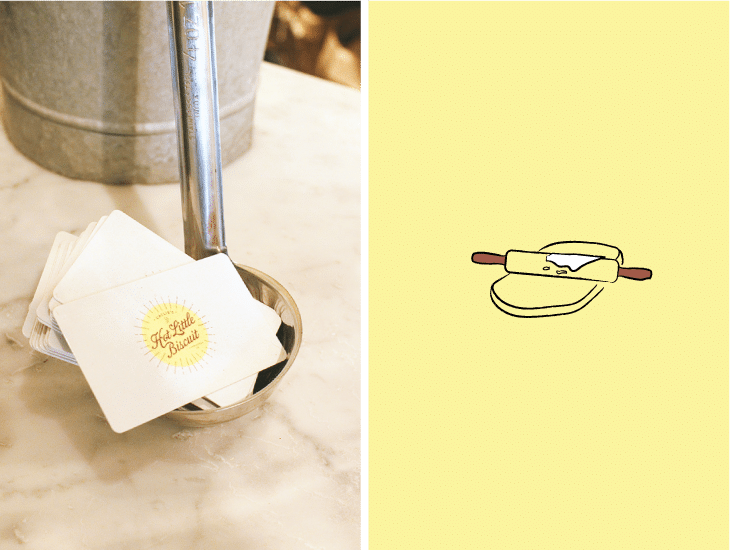
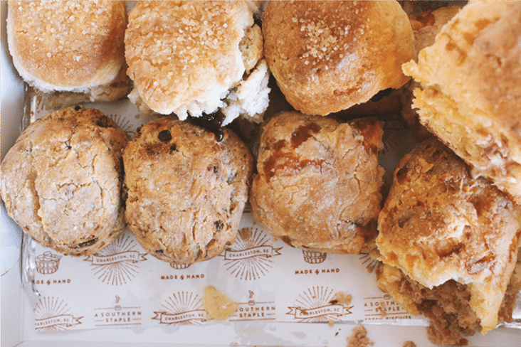
Interior Details for Callie’s Hot Little Biscuit
January 29, 2015
Callie’s Hot Little Biscuit is one of our favorite counter-service restaurants downtown. We snapped a few pictures of the small and cozy space we designed. From paint and material selection to signage and shelf styling we had fun infusing the space with branded details.
Client: Carrie Morey
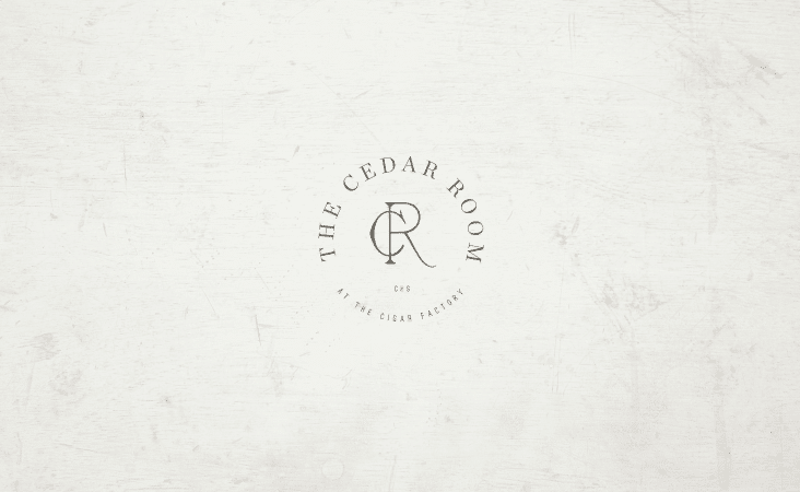
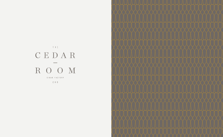
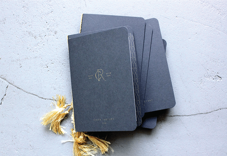
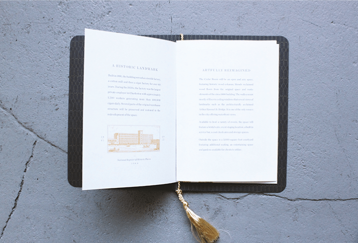
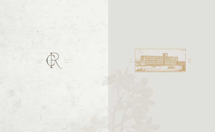
The Cedar Room
January 27, 2015
The Cedar Room at the Cigar Factory will be an open and airy space in a historic circa 1880 building. We’ve had the pleasure of working on this project from the beginning, starting with the naming, logo creation and a teaser piece to help promote the space that will open this Spring. We used a handsome palette, metallic inks and traditional type to establish the tone for this inspiring space.
Client: The Cigar Factory
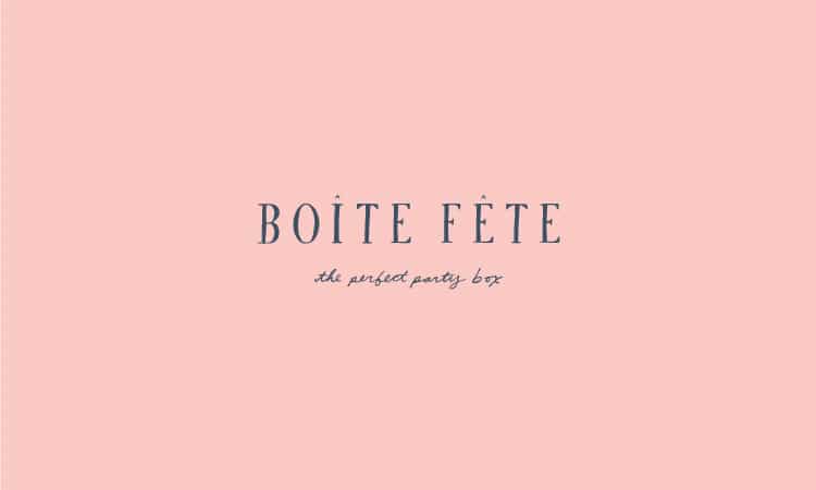
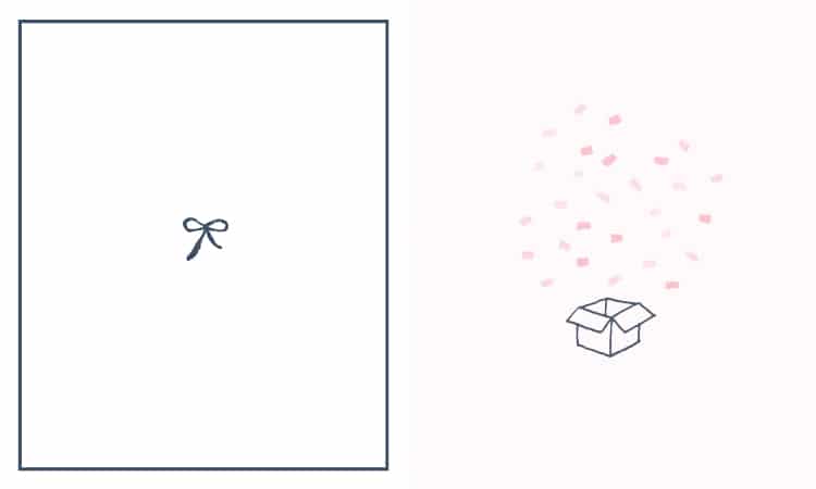
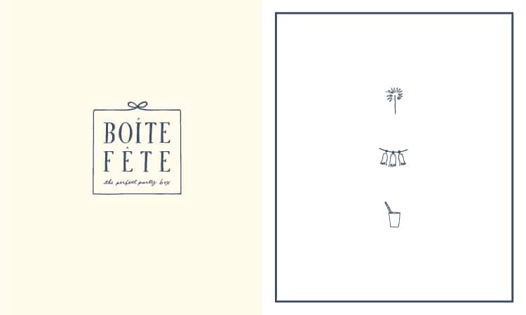
Boite Fete
January 22, 2015
Boite Fete is a new company who will curate all the items for the perfect party, mailed to you in the perfect party box! Custom type and hand-drawn illustrations make up this playful new brand.
Client: Rachel Huntington
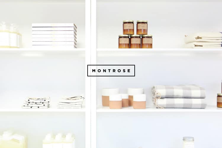
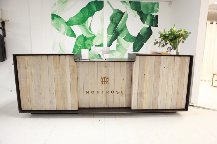
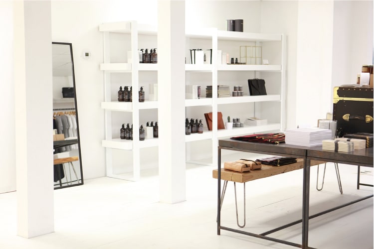
Montrose
January 21, 2015
Montrose is a new lifestyle store in Houston Texas. We had the pleasure of working with Juley Thuy Le and Kim Nguyen to develop the logo and in-store materials. Named after and inspired by the Montrose neighborhood, their goal was to bring Paris to Texas in a thoughtful way. And they have succeeded. The store is a perfectly curated selection of clothing and much more. Congratulations on the opening – we can’t wait to come visit in person!
Photography provided by: Allamar Young of Capture Classic
Client: Juley Thuy Le and Kim Nguyen

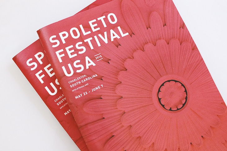
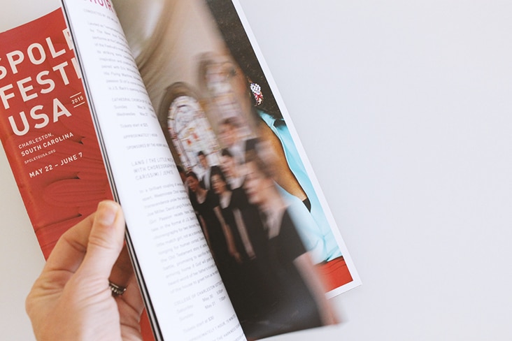
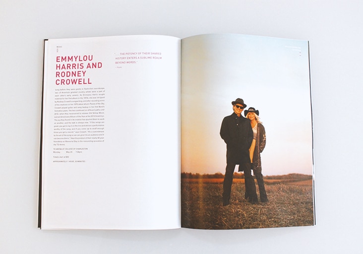
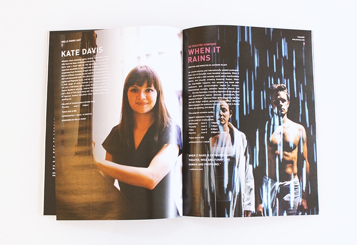
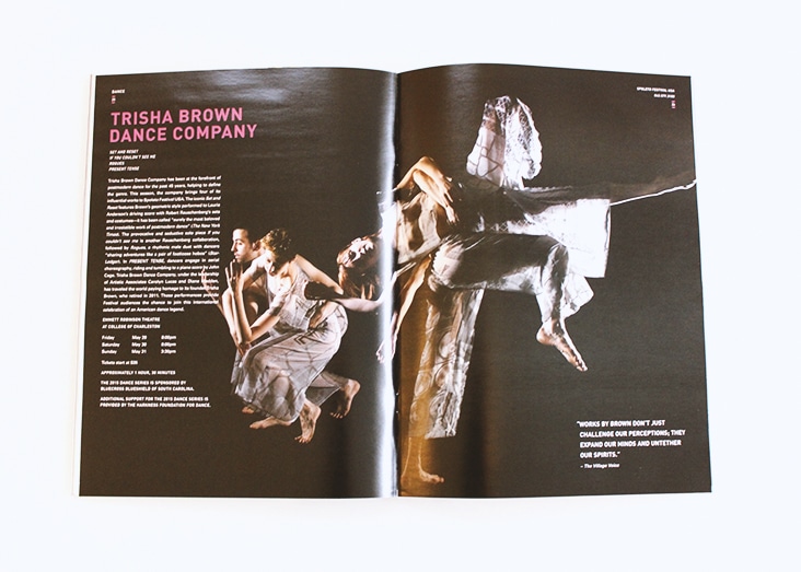
Spoleto Festival USA 2015
January 15, 2015
The 2015 Spoleto ticket brochures have arrived. This year is another fabulous line up of performances. Bold type and color pop against beautiful performance imagery.
Client: Spoleto Festival USA
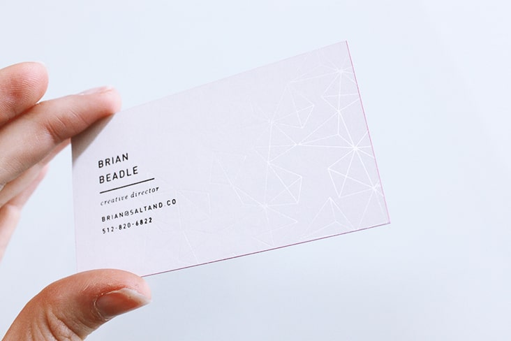
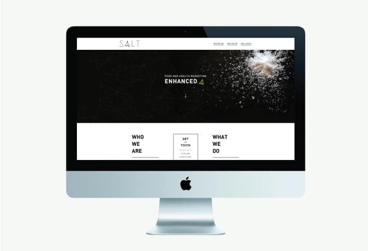
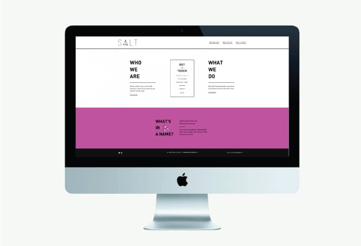
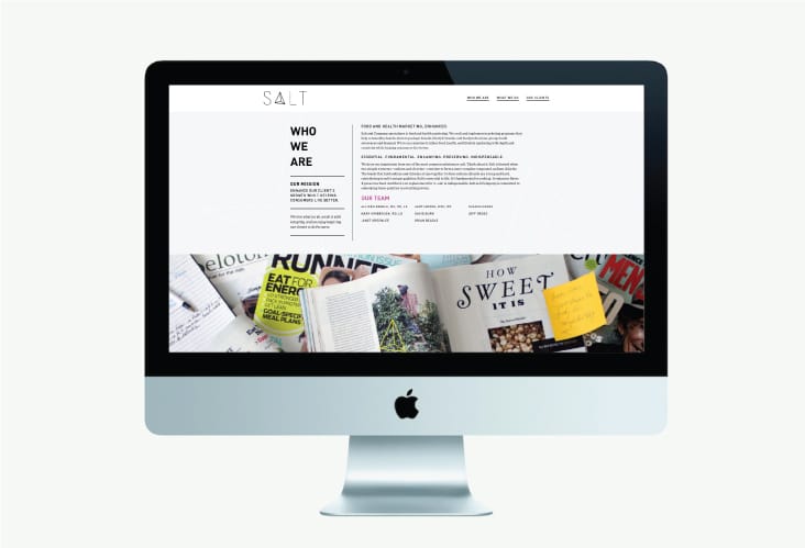
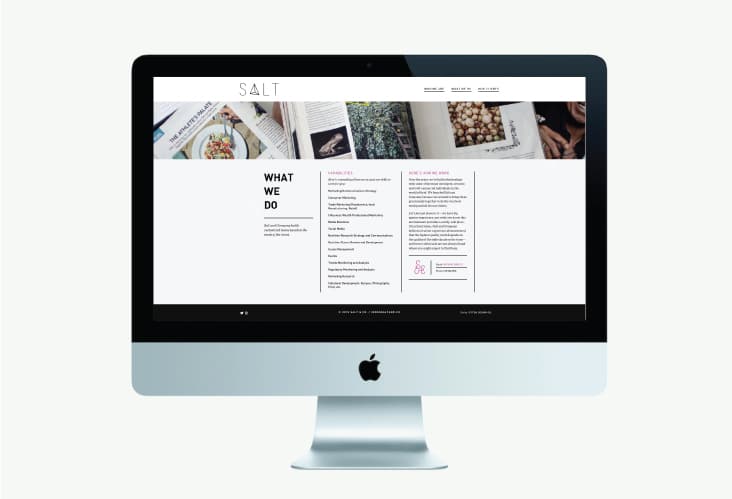
Salt and Company
January 7, 2015
Salt and Company specializes in food and health marketing. They craft and implement marketing programs that help commodity boards, farm to package brands, lifestyle brands, and food professional groups build awareness and demand. They are on a mission to infuse food, health, and lifestyle marketing with depth and creativity while helping consumers live better. It was a pleasure working with Allison and Brian on the redesign of their logo, identity package and website. We’re thrilled with the outcome and can’t wait to share more upcoming work for Salt and Co. soon.
Client: Allison and Brian Beadle

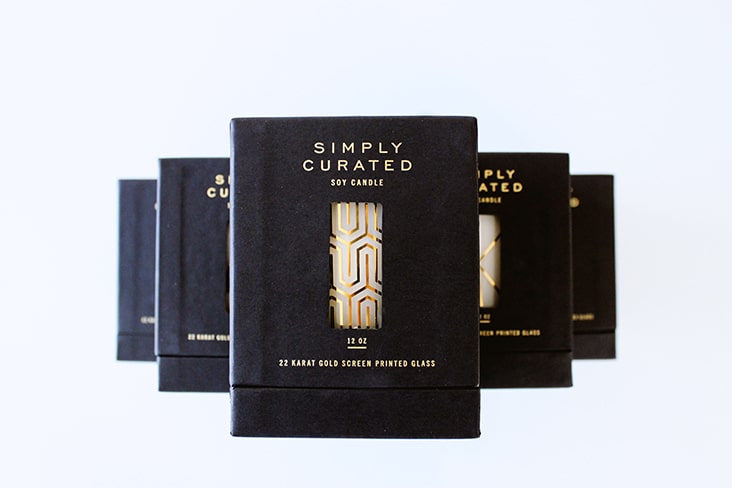
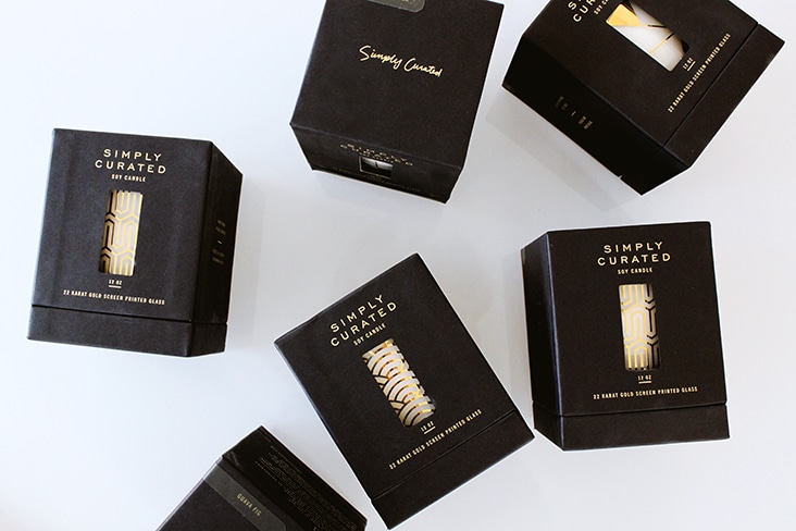
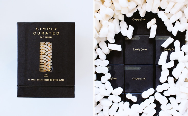
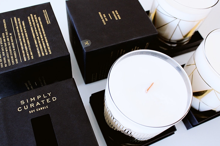
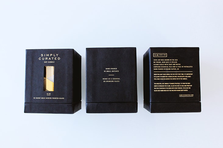
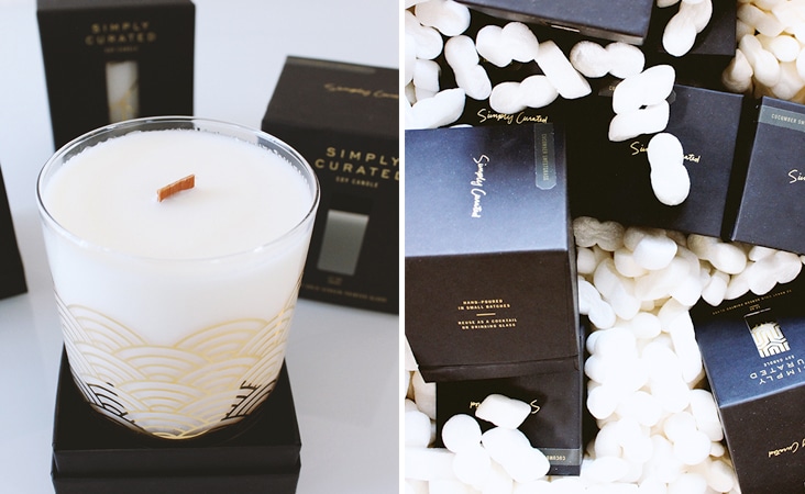
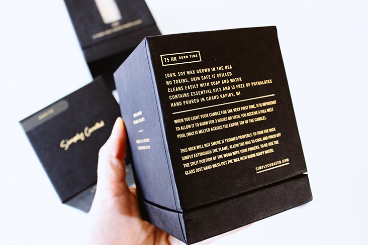
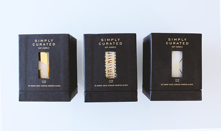
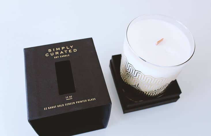
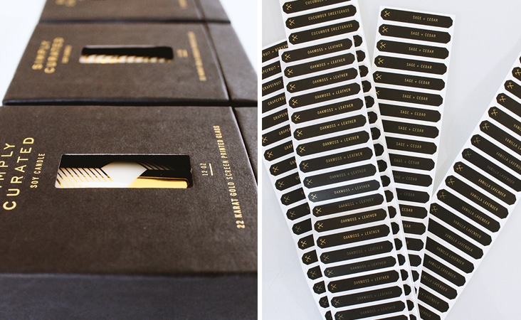
Simply Curated
December 22, 2014
Simply Curated is an artisanal candle company. Sarah Cooley started Simply Curated as a hobby of buying vintage pieces and selling them online. It quickly turned into a beautiful candle business. With six different silkscreened patterned designs, we developed the packaging to showcase the beauty and simplicity of these vintage inspired cocktail glass candles. After you’ve burned the candle, the wax washes away with soap and water and you’re left with cocktail glass to continue to enjoy.
Client: Sarah Cooley
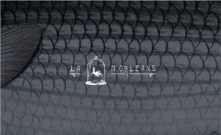
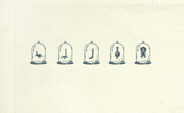
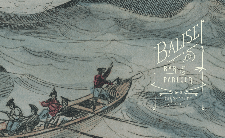
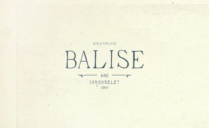
Balise
December 16, 2014
Evoking the bygone era of Old-World New Orleans, Balise is a new restaurant set in a 19th century Creole townhouse, featuring a Louisiana-focused menu created by Chef Justin Devillier (James Beard finalist for Best Chef: South in 2012, 2013, and 2014). The name Balise is derived from the first settlement at the mouth of the Mississippi River’s Birdfoot Delta, which controlled commerce coming from the Gulf of Mexico to New France.
The origin of the restaurant’s name served as inspiration for the initial brand development. Eccentric elements, coupled with New Orlean’s culturally rich past is reflective in the graphic details, hand-rendered type and color palette. We’re currently working with Justin and Mia on the printed materials and digital presence, which will launch in January.
Client: Justin and Mia Devillier
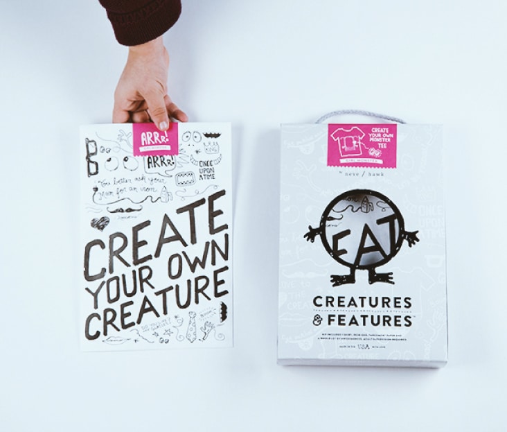
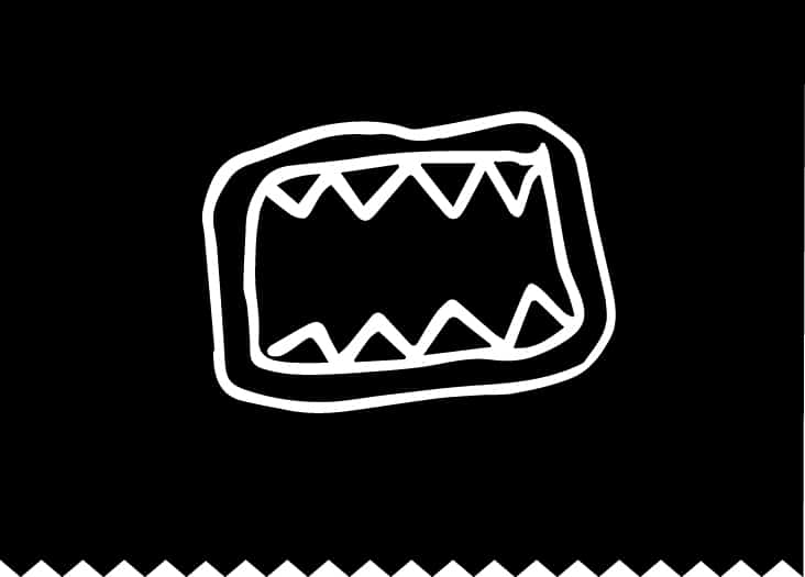
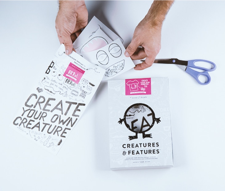
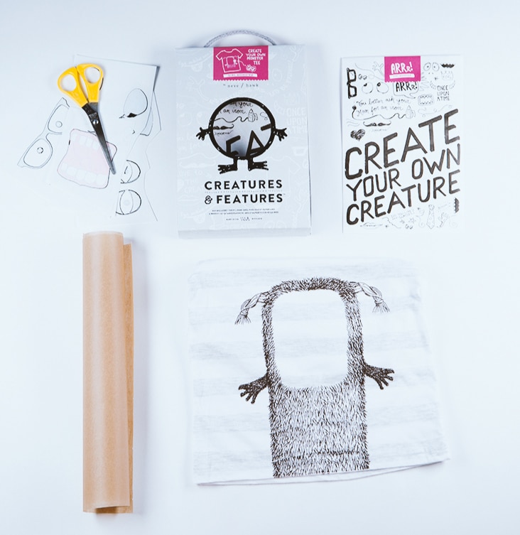
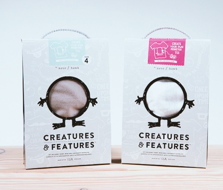
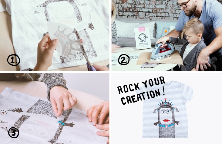
Creatures & Features by Neve Hawk
December 11, 2014
We’re excited to share this new packaging project for Creatures & Features by Neve / Hawk. Creatures & Features is easy peasy, lemon squeezy.
1. Cut out the features.
2. Iron on your features.
3. Rock your creation!
This project was a true collaboration between Stitch and the client, Bob and Kris of Neve / Hawk. They provided us a range of hand drawn illustrations and we put it all together in a fun package complete with custom printed and constructed die-cut box, silkscreened monster tee and printed tyveck envelope with iron-on features. We love the creativity and personality behind this product. View all the adorable creations here.
Client: Bob and Kris Galmarini