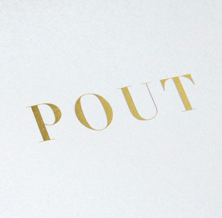
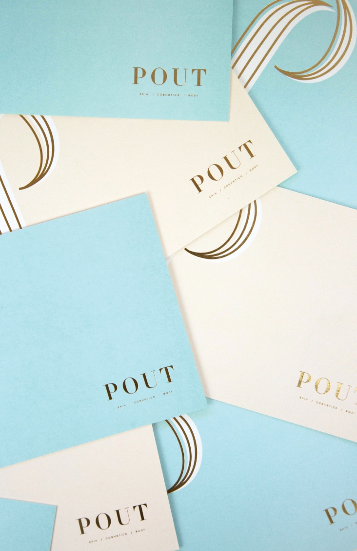
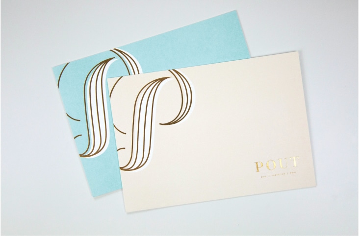
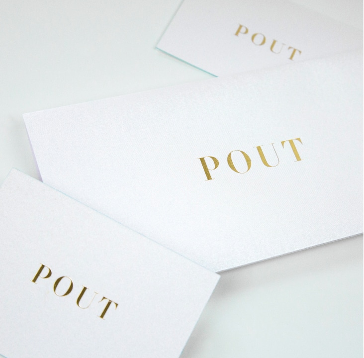
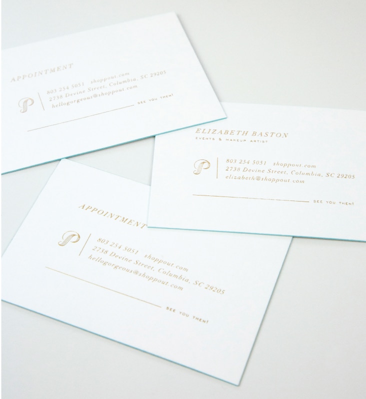
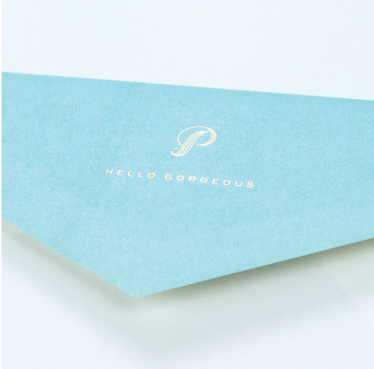
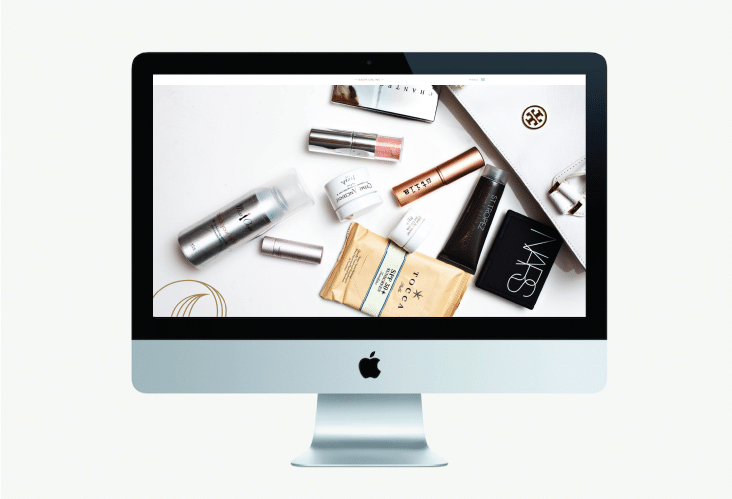
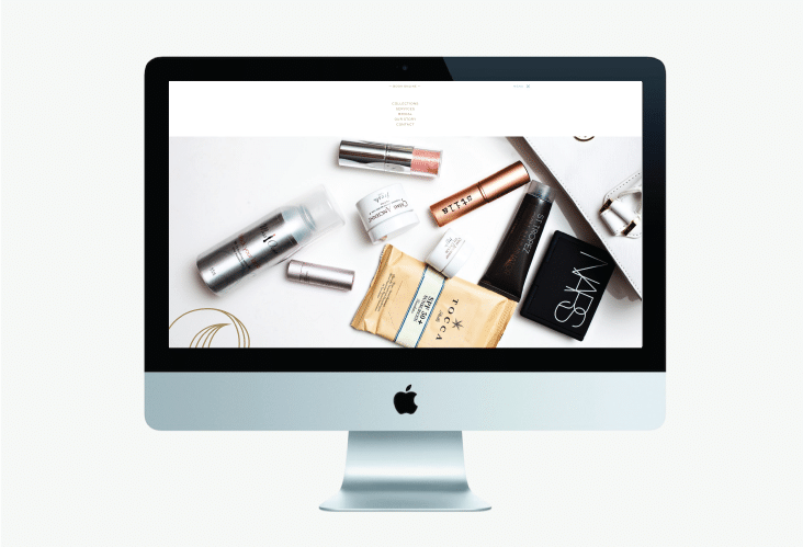
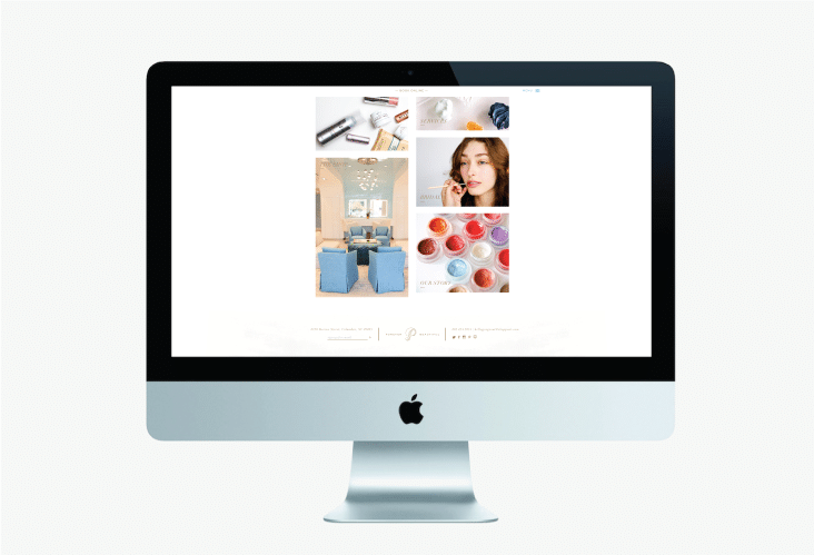
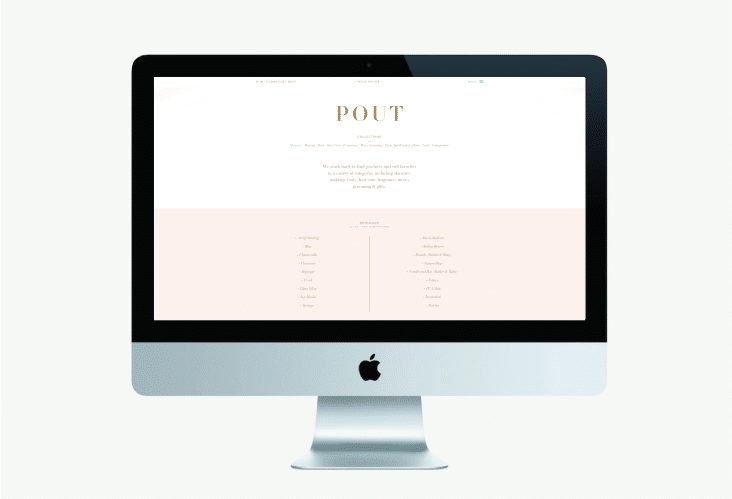
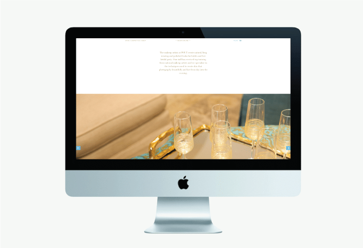
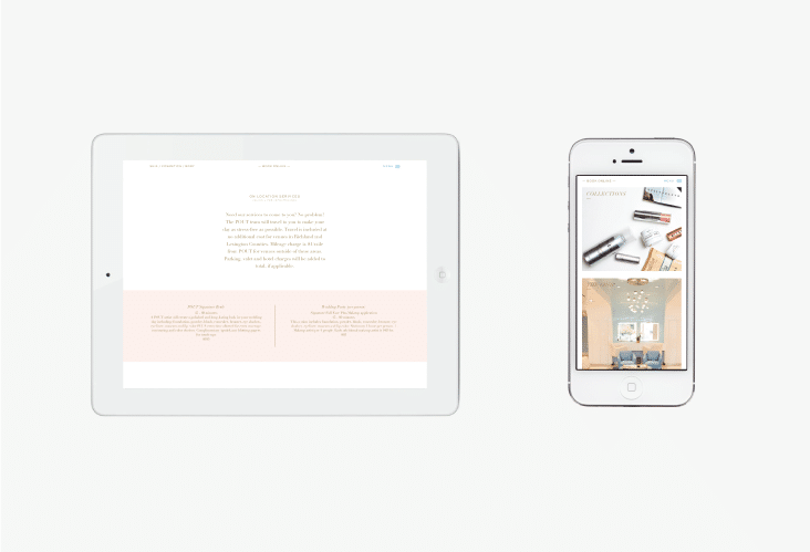
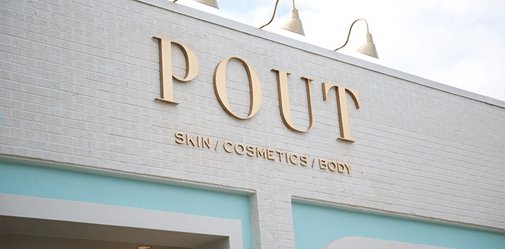
New work for Pout, a beauty emporium in Columbia, South Carolina stocked with the most sought-after skincare and cosmetic lines.
Posts Tagged ‘Identity Design’
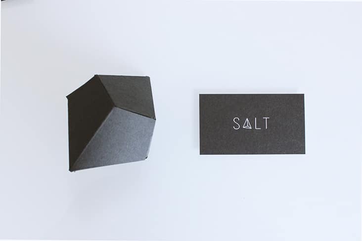
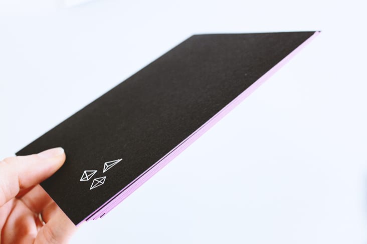
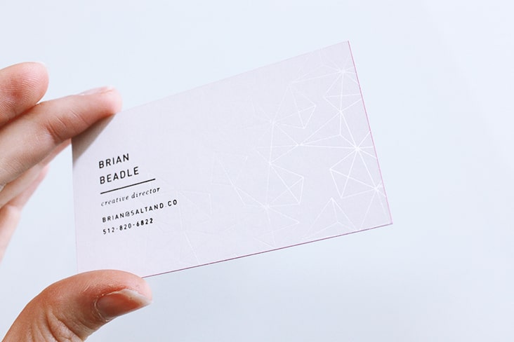
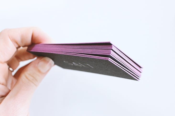
Stationery Package for Salt & Co.
February 3, 2015
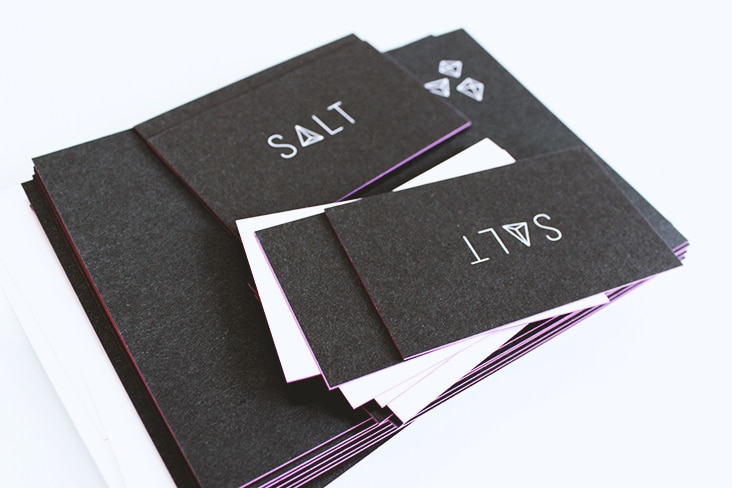
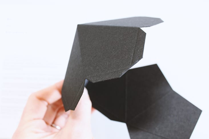
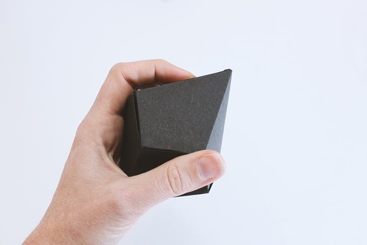
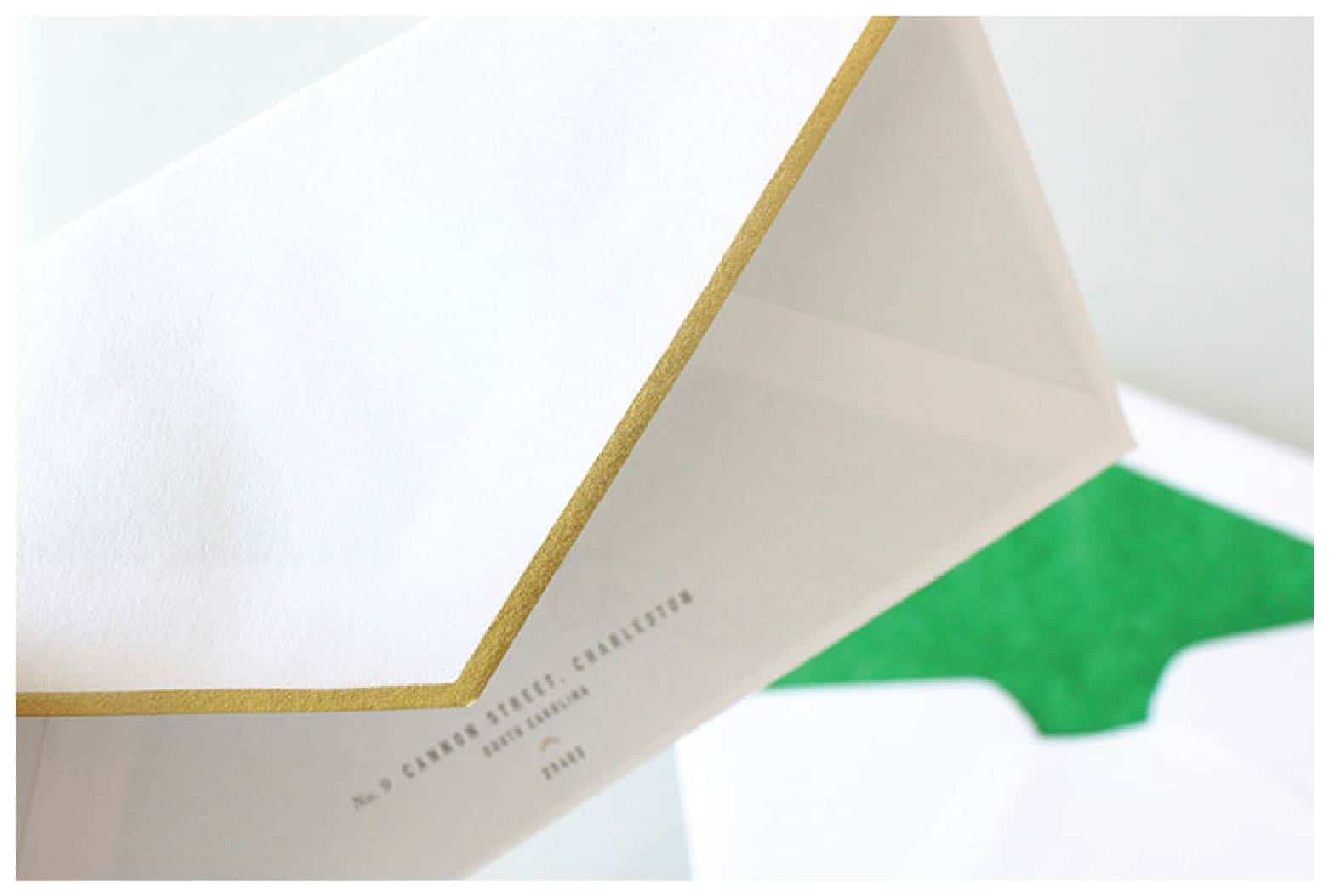
More new work to share from Salt & Co. Duplexed paper, foil stamp and edging along with die-cut, three dimensional crystals bring this re-brand to life.
Client: Brian and Allison Beadle
The Campbell Foundation
November 5, 2014
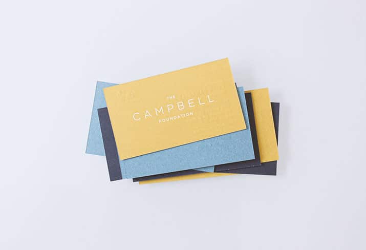
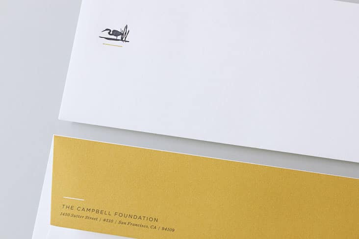
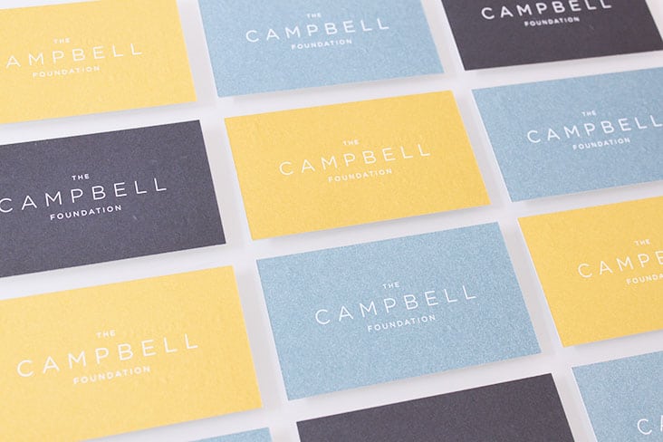
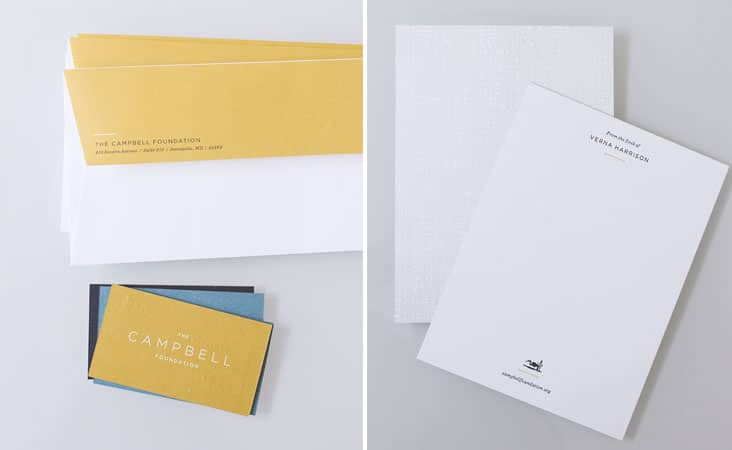
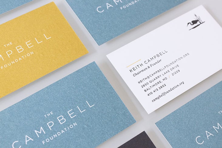
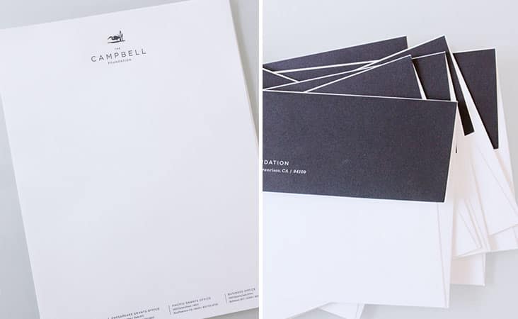
A bold yet sophisticated stationery package for The Campbell Foundation. The Campbell Foundation was established in 1998 to improve the conditions of America’s largest and most ecologically diverse and productive estuary systems: the Chesapeake and Atlantic Coastal Bays. In 2003, the geographic focus was expanded to to include Northern California and the San Francisco Bay watershed.
The stationery packaged was produced using both offset and letterpress printing techniques. The suite included business cards, letterhead, personalized notecards and matching envelopes.
Client: Samantha Campbell
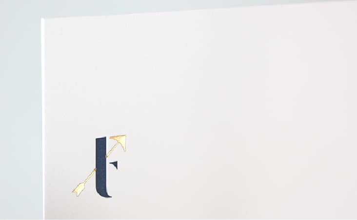
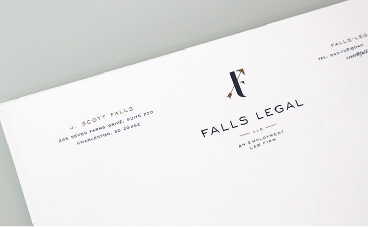
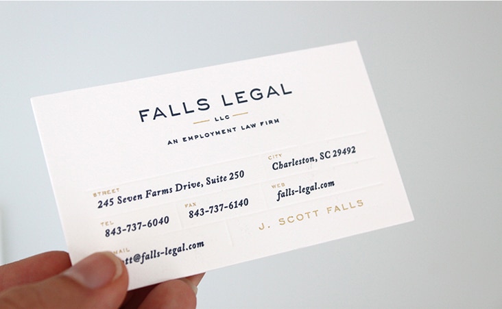
Falls Legal Branding and Stationery
August 19, 2014
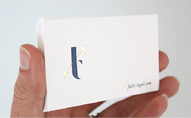
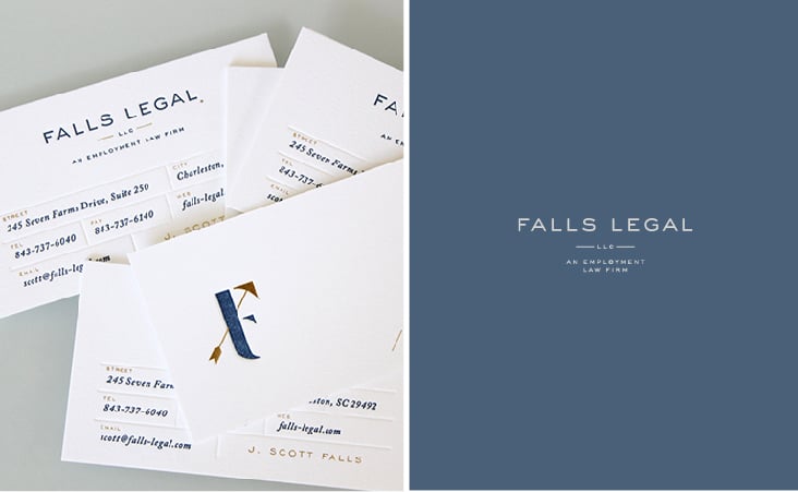
A fresh new logo and identity for Falls Legal.
Client: J. Scott Falls
A New Look
March 21, 2014
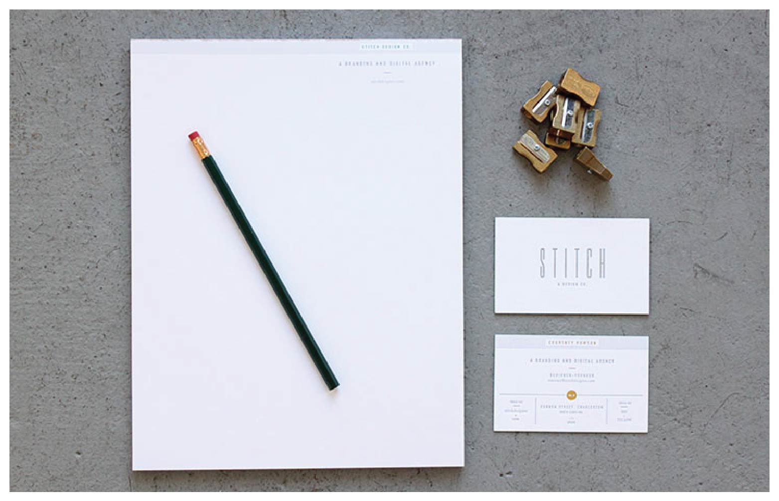
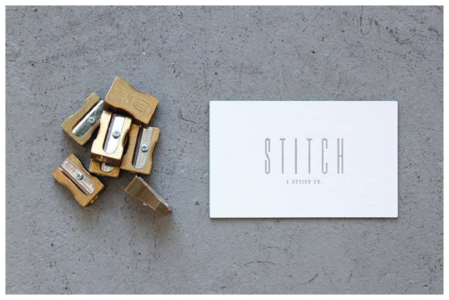
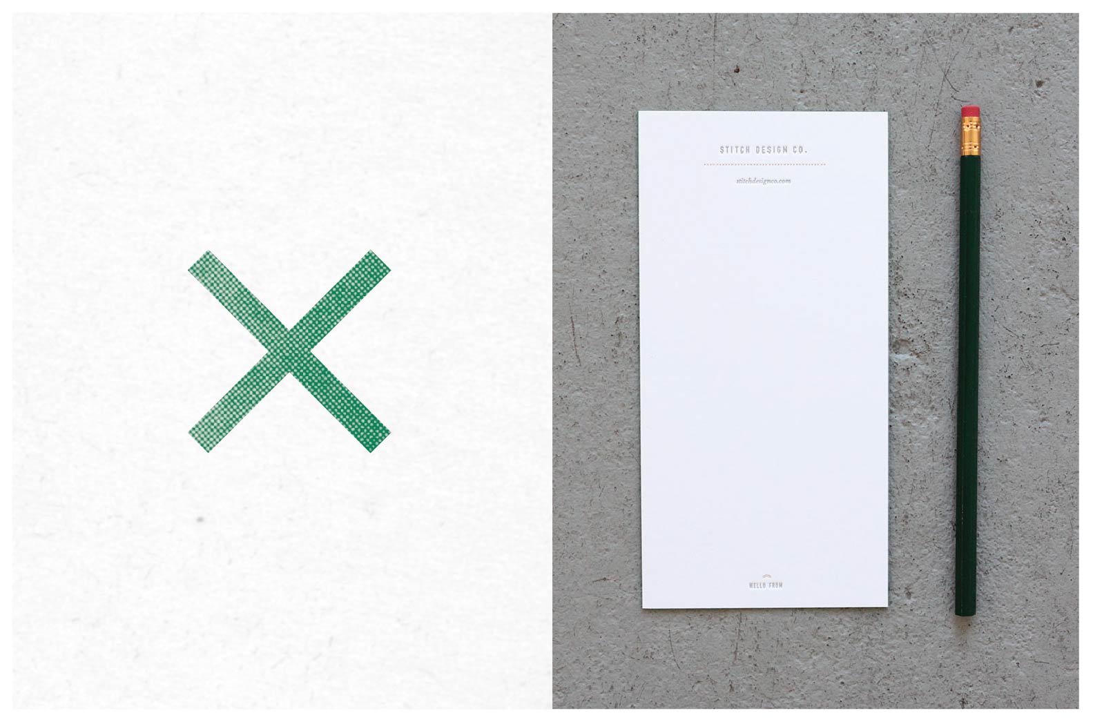
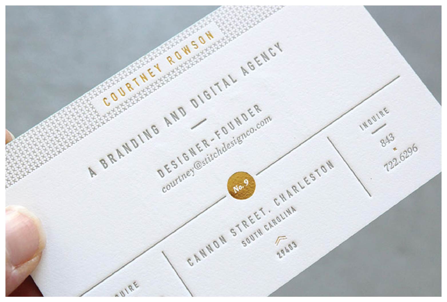
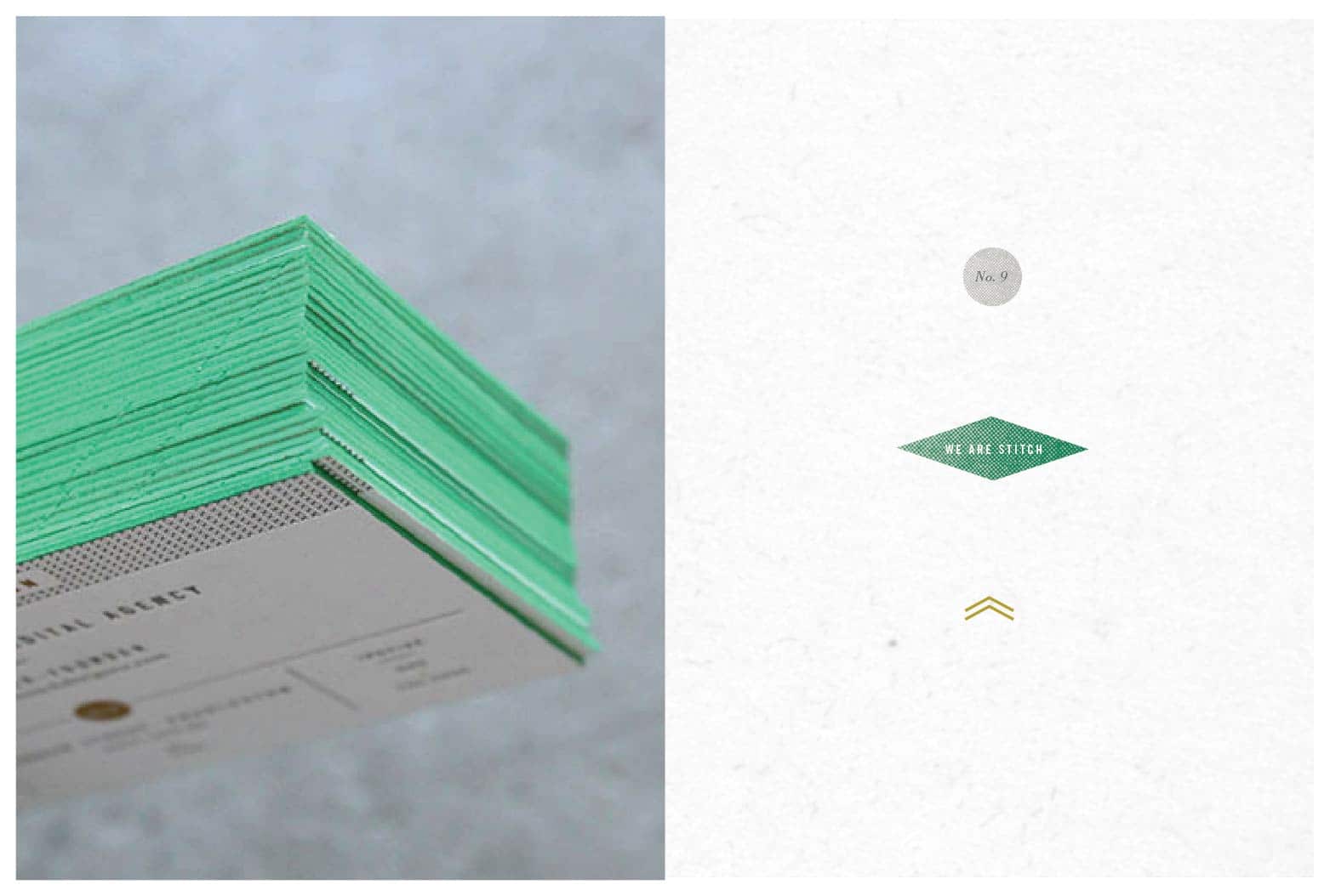
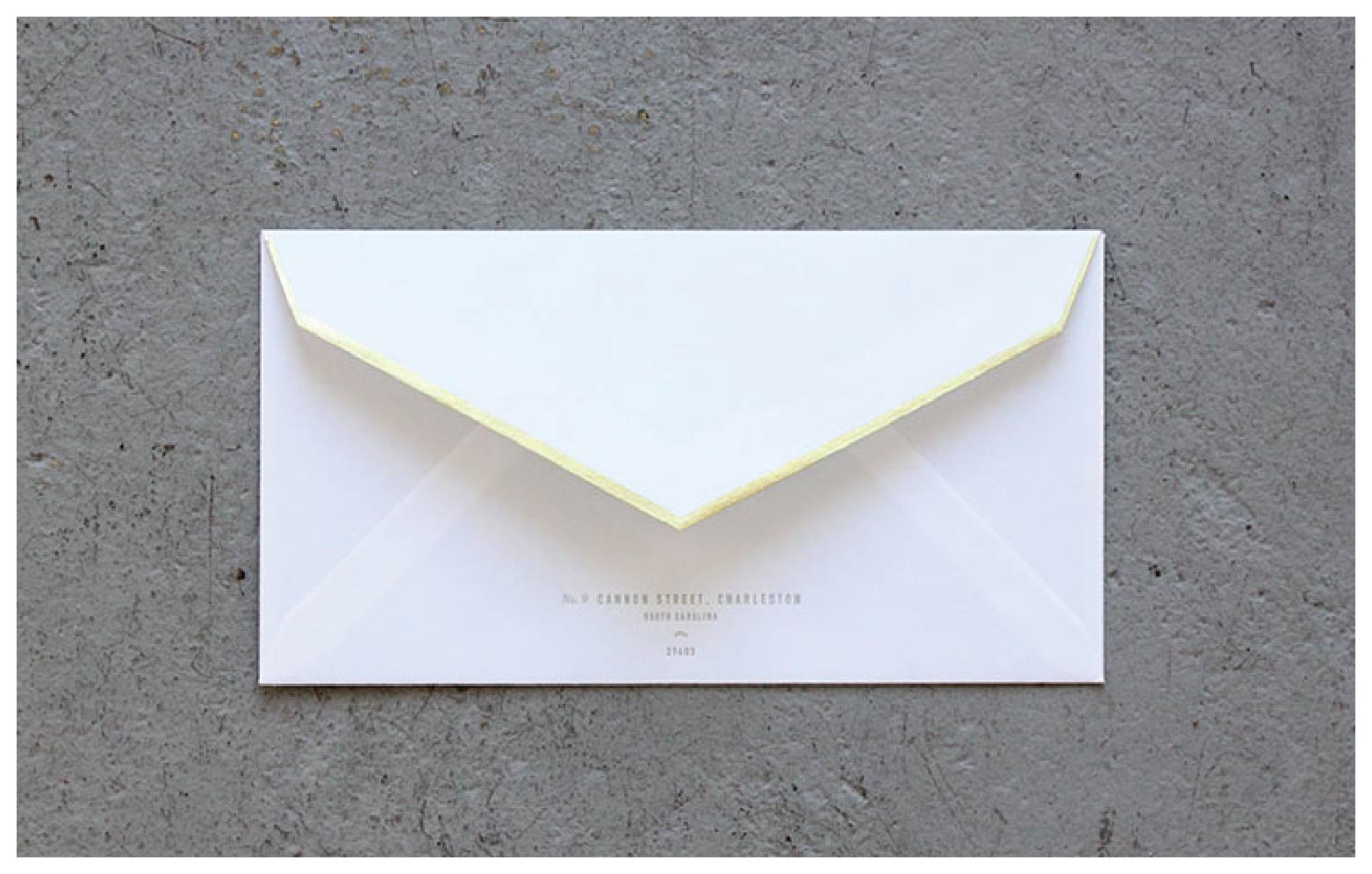
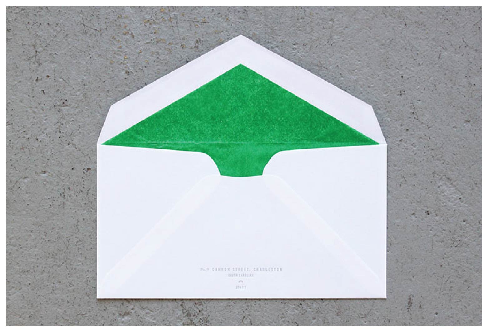
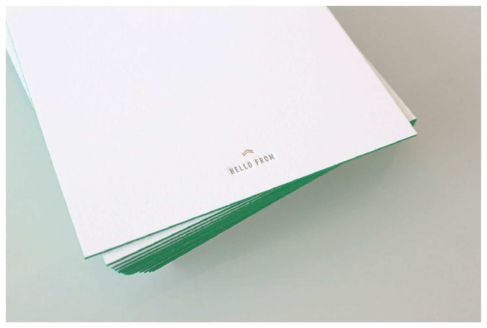
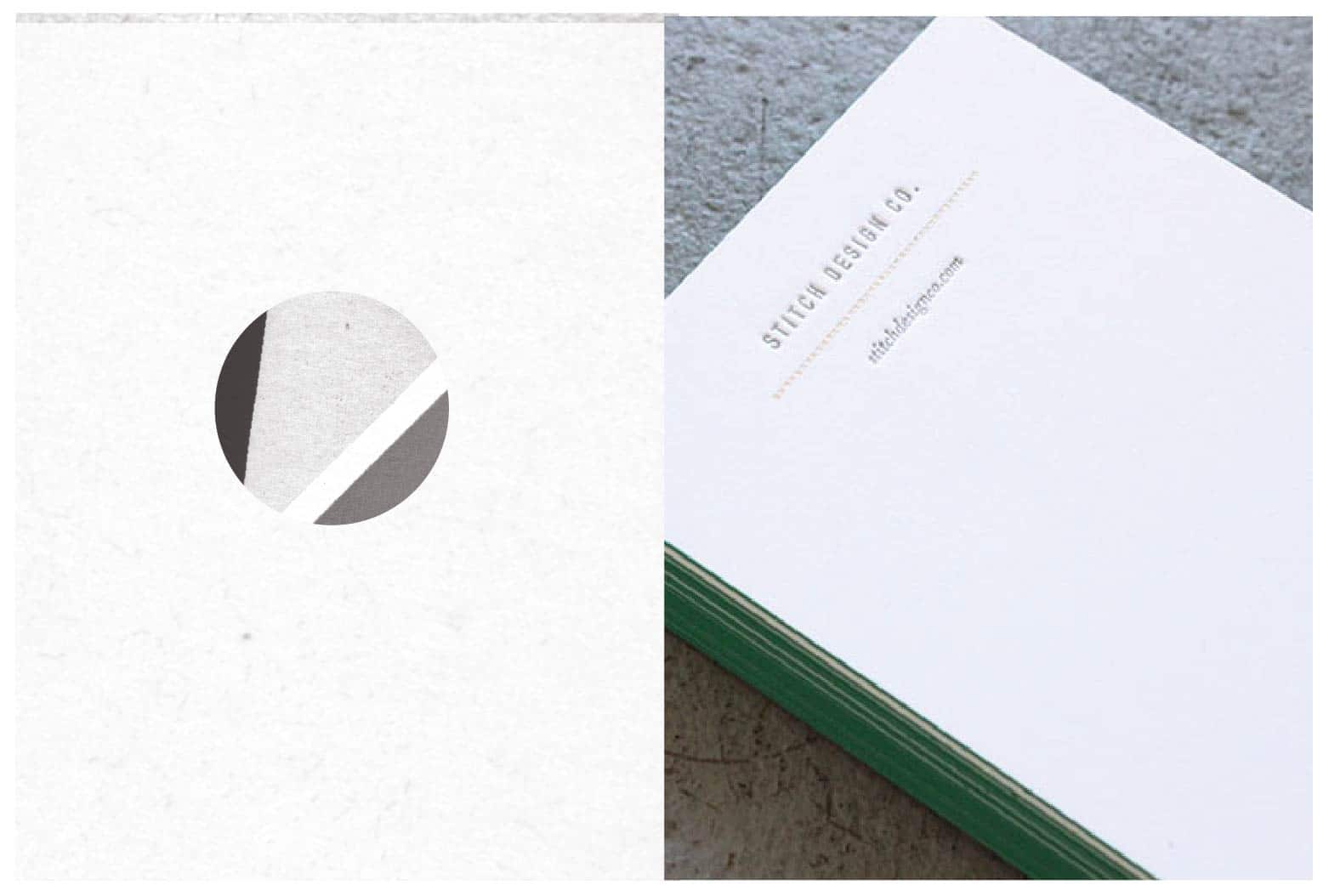
Along with a new website and blog, we’ve recently updated our stationery package. Gold foil, letterpress, green edging and tiny details are the elements that define our new look. We are currently infusing the new look into our office. We’ve changed the door to green and covered our store front windows with tiny gold “x’s” .
Client: Stitch Design Co.
Hob Nob Stationery Package
December 11, 2012
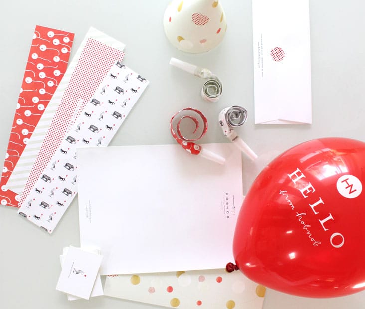
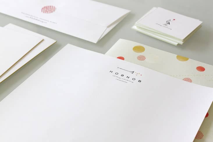
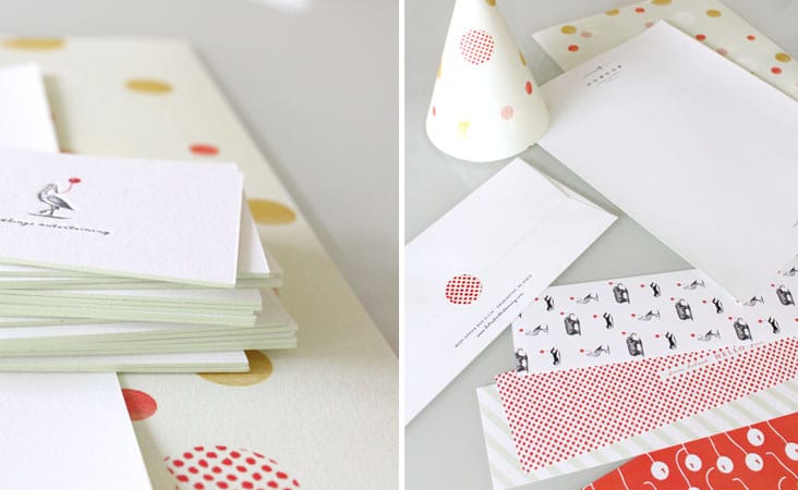
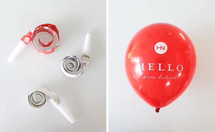
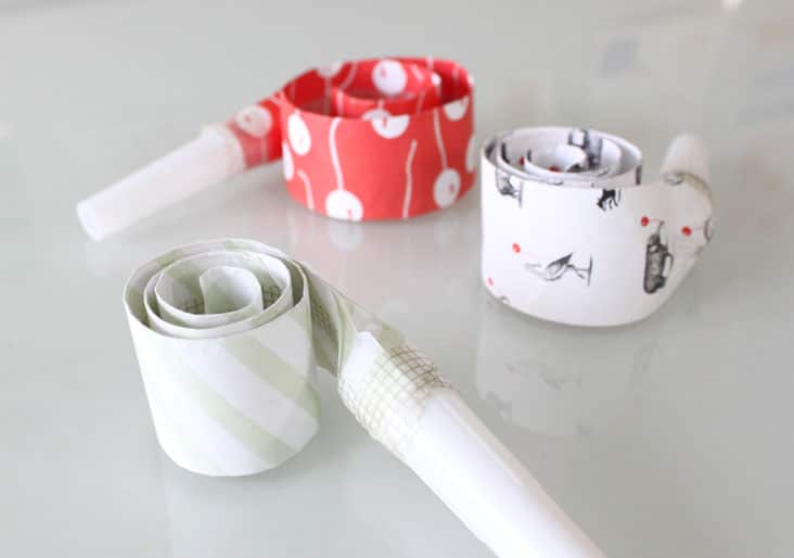
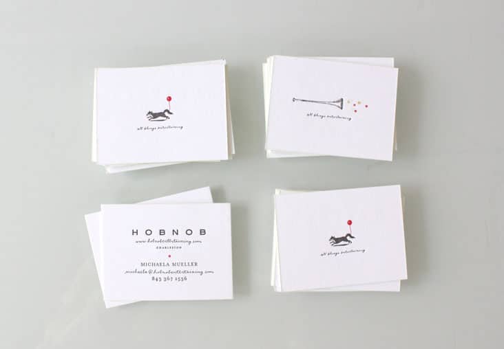
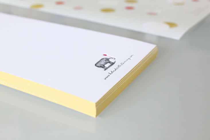
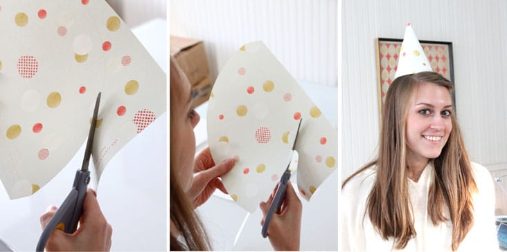
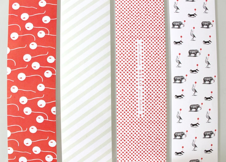
With a name and company like Hob Nob (see their branding here), we knew we couldn’t just design your standard stationery package. We designed this suite to feel unique, fun and interactive. The letterhead transforms into a party hat. The note card comes with a balloon attached and custom printed party blowers were a must have item to be included in this suite. Etched animals with balloons in tow adorn the fronts of the business cards. Read the rest of this entry »
Client: Hob Nob
Lichty Guitars
September 3, 2012
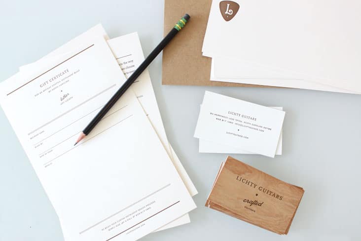
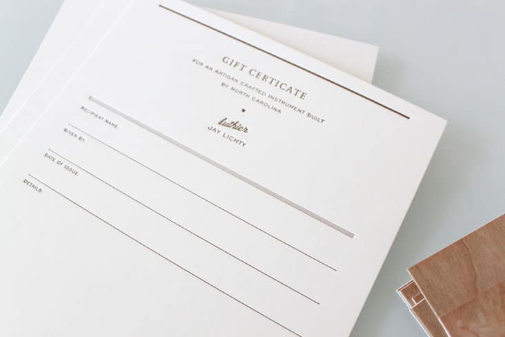
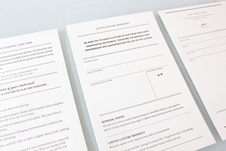
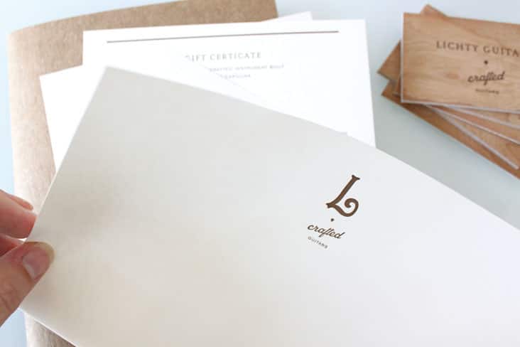
We were first introduced to the beautiful work of Jay Lichty through Garden and Gun Magazine several years ago. The magazine awarded the talented luthier as the overall winner of the Made in the South Awards in 2010. It was a pleasure meeting Jay and his wife Corry then and we’ve been following his beautiful work ever since. We were thrilled to get a call from them this summer to help them take the presentation of their brand to the next level. Read the rest of this entry »
Client: Litchy Guitars
Sunday Entertainment
August 21, 2012
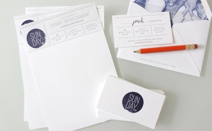
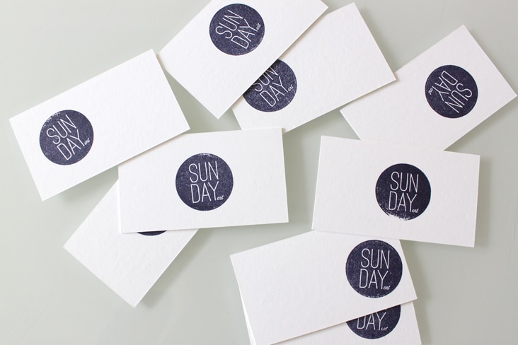
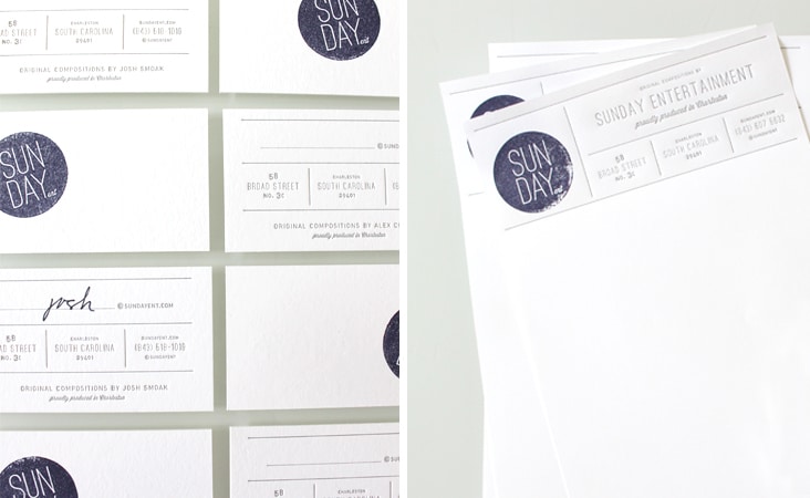
Josh and Alex of Sunday Entertainment are two inspiring dudes! They create original compositions for advertising, film trailers, brand films, and documentaries. We helped them freshen up their logo and apply it to some everyday letterpressed stationery. Check out their work, many of their catchy tunes will sound familiar!
Client: Sunday Entertainment
Elizabeth Porcher Jones
June 26, 2012
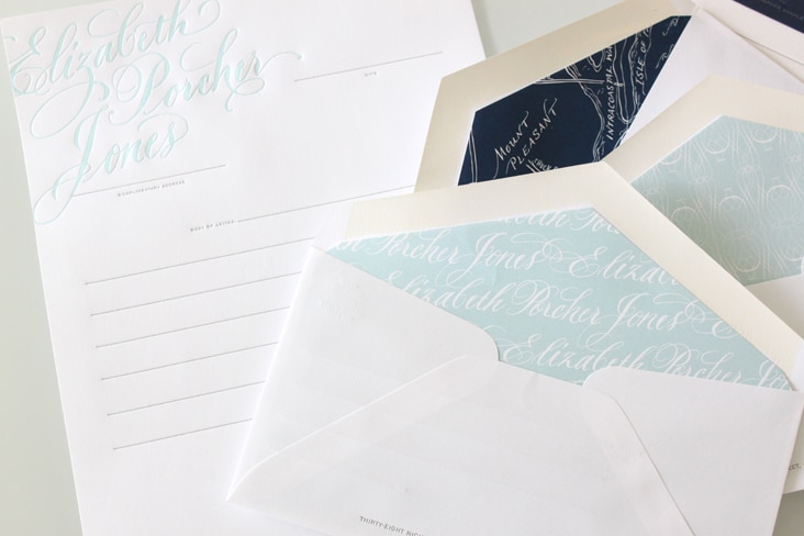
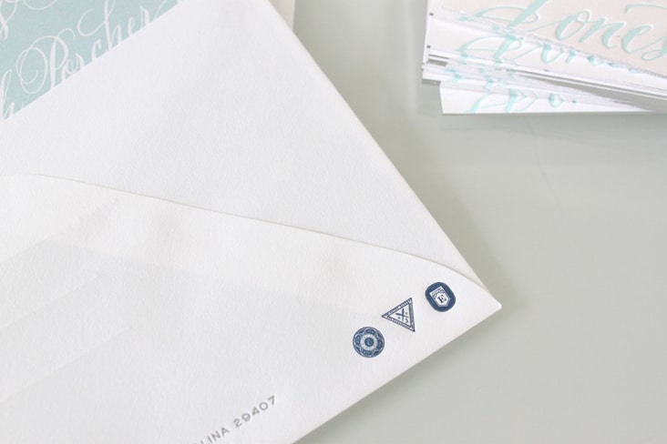
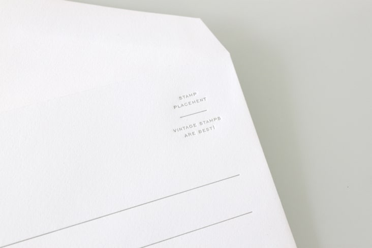
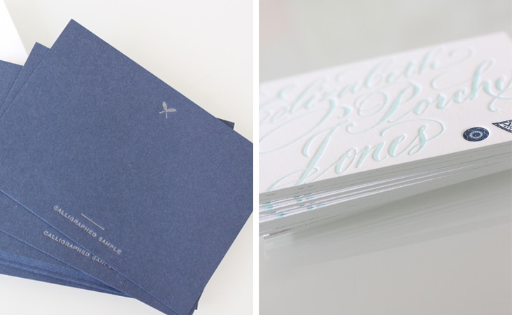
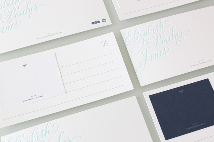
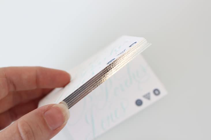
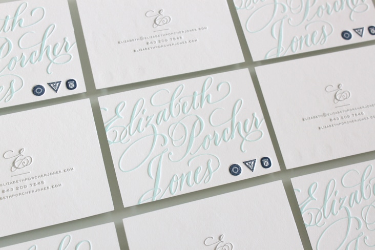
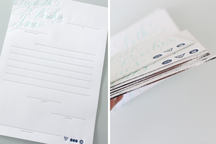
Elizabeth Porcher Jones is a talented calligrapher based out of Charleston, SC. We have collaborated with Elizabeth for many years, so needless to say, we were thrilled when she came to us to design her stationery package (and next her website). It was truly an honor to work with such beautiful assets. We designed this set to highlight her calligraphy and used support elements such as edging, fictitious guild logos, letterpress printing and letter writing etiquette to bring it all together. Read the rest of this entry »
Client: Elizabeth Porcher Jones
Eberjey Stationery Package
June 6, 2012
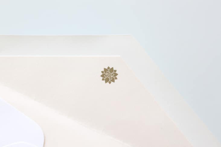
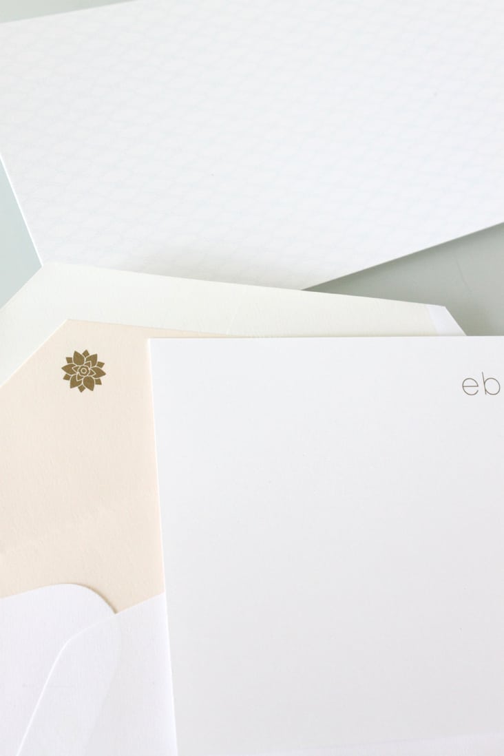
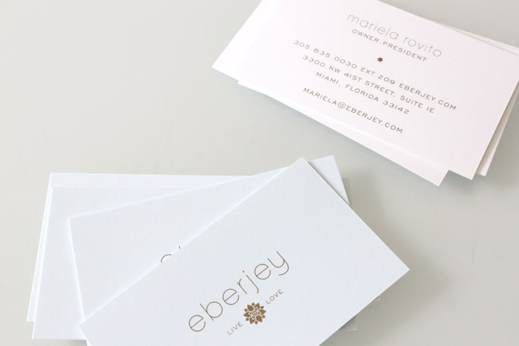
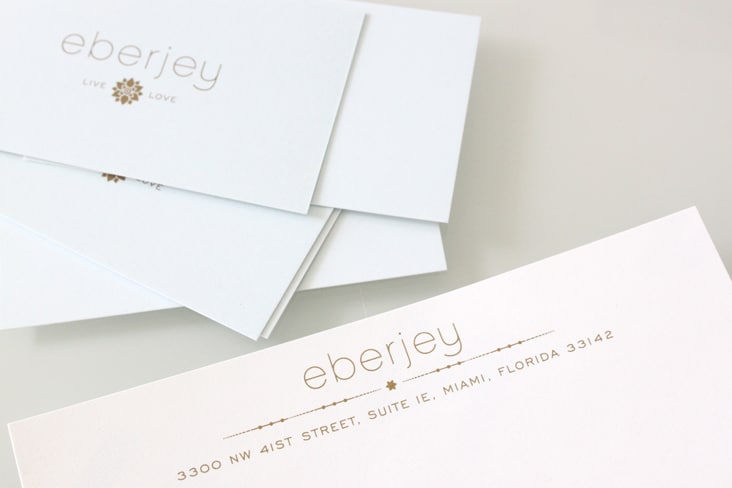
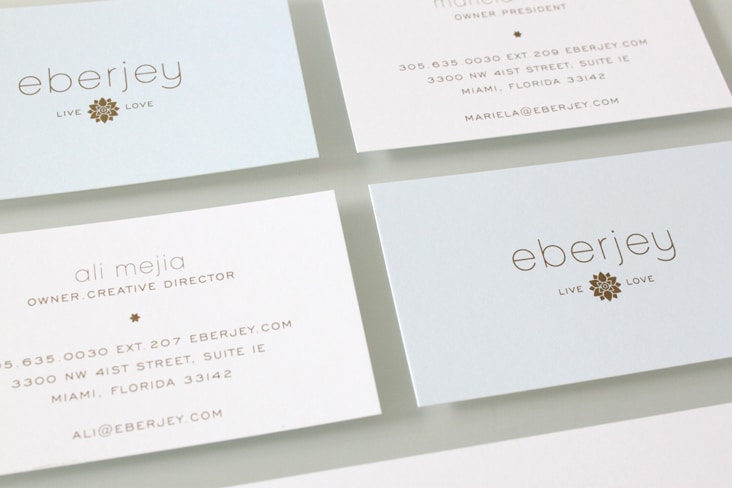
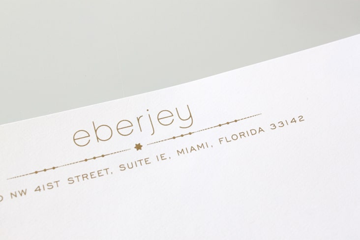
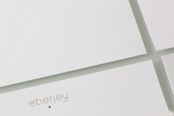
We’re excited to share the newly redesigned Eberjey stationery package. We used Metallic gold ink, pattern and their signature Eberjey blue to make this stationery set elegant, sophisticated and luxurious – just like their brand. Read the rest of this entry »
Client: Eberjey
