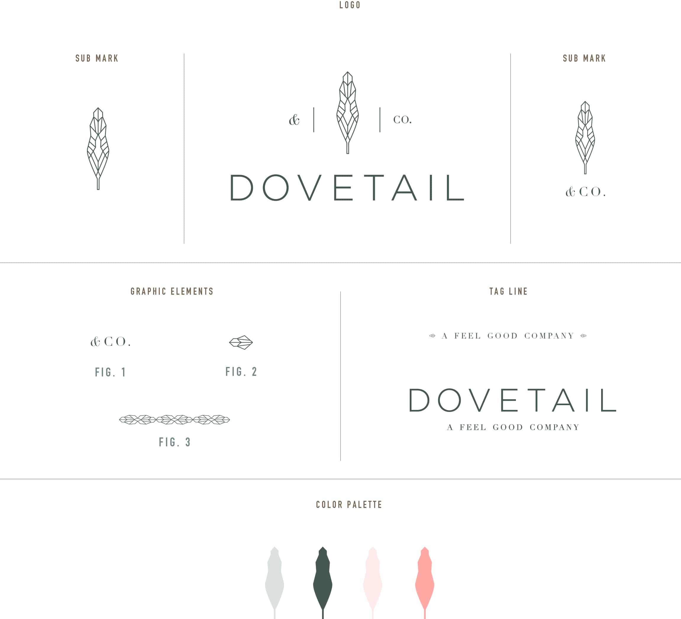
Dovetail & Co. is a unique new company designed to eliminate the guess work of finding an experienced practitioner in the health and wellness industries. By getting to know your needs, goals and experiences, Dovetail accurately matches you with the ideal practitioner for single service visits, or as part of a long-term health, nutrition or fitness program. Read the rest of this entry »
Posts Tagged ‘Branding’
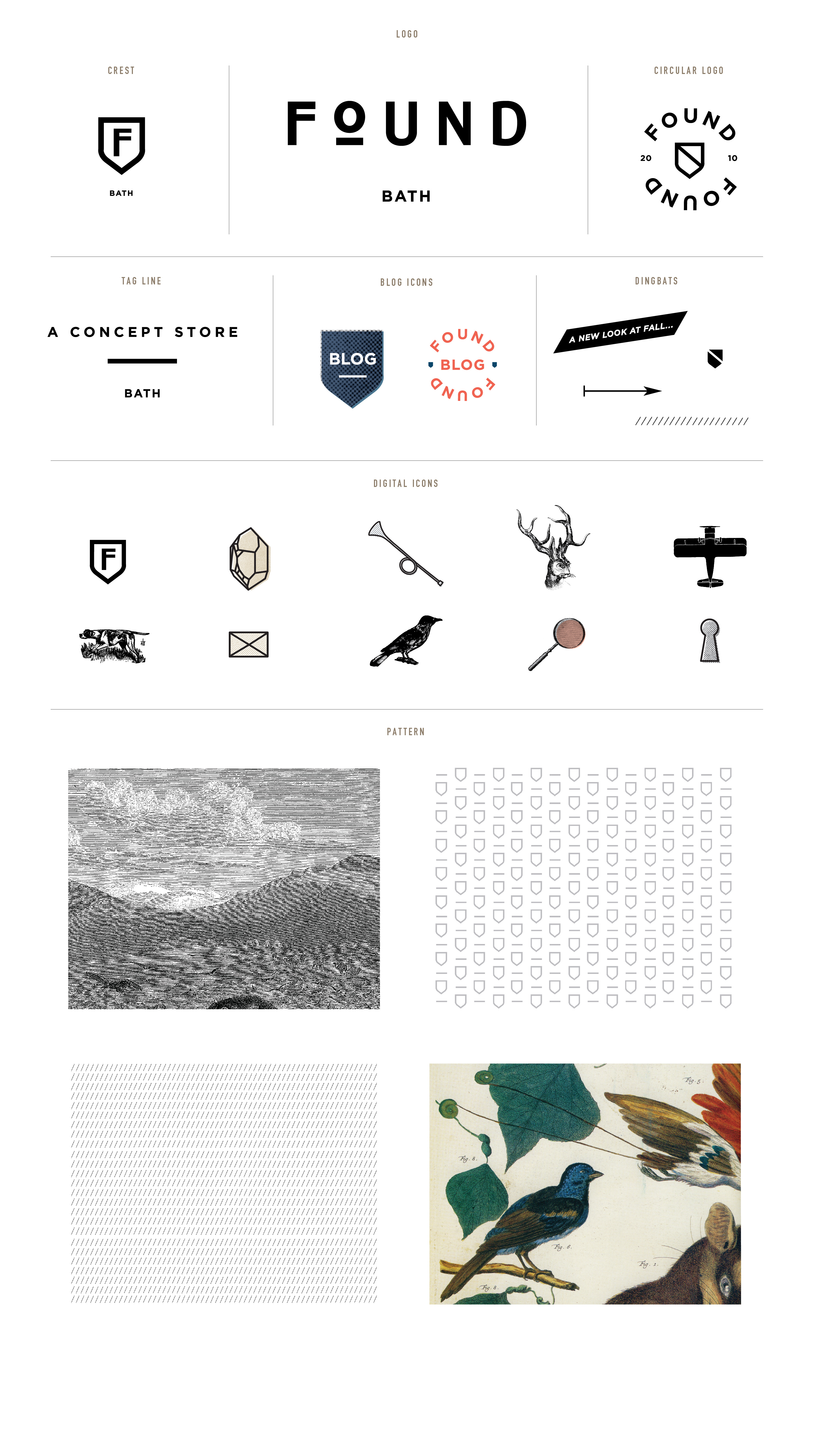
Found Bath Branding
December 19, 2012
Found is a concept store in Bath that looks for the undiscovered, the classic and the contemporary. Found came to us to build a brand around their unique store. We used their phrase– “We believe there is a bit of luxury for everyone” as a starting point to design icons, patterns and sub marks. They are launching a new site soon which will incorporate all of the new elements, we can’ t wait to see it live!
Client: Found
Wildsam Field Guides
October 10, 2012
We’re so excited to share the new brand we designed and developed for Wildsam Field Guides, a new American travel series. Taylor and Robin were looking for a simple, bold mark that felt both timeless and current. We thoroughly enjoyed collaborating with Taylor and Robin on this project. And because Taylor is an excellent writer, well, we thought we’d let him do most of the talking: Read the rest of this entry »
Client: Wildsam Field Guides
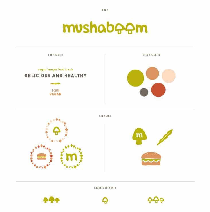
Mushaboom
May 18, 2012
Mushaboom is a vegan burger truck which can be seen traveling around the South Florida coast. Kristina and Nicole, long time friends and recent college graduates, were fed up with the lack of vegan and vegetarian options in South Florida and came to Stitch to help give their great idea a visual voice. All of their burgers are handmade and fresh, using no frozen or boxed ingredients. We designed their logo and branding to feel fresh, youthful and fun. Read the rest of this entry »
Client: Mushaboom
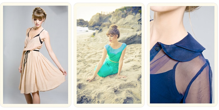
Vee
March 26, 2012
Veronica Scott is the talented designer behind VEE, a collection of women’s clothing designed and produced in California. Her Spring 2012 line is made up of classic silhouettes paired with quirky prints in a dreamy color palette. That unique pairing was the inspiration behind the branding for VEE. For the logo, we paired a classic “V” typface with a hummingbird wing (hummingbirds are one of Veronica’s favorite things) and took a cue from her lovely prints while developing her color palette.
Client: Vee
Eberjey Brand Update
March 9, 2012
We’ve been long admirers of the company Eberjey, so when Ali and Mariela gave us a call to help them refresh their brand, we were thrilled. Ali and Mariela started Eberjey 1996 from the belief that the layer worn next to the heart should express happiness, love and confidence. We updated their logo while maintaining all of the elements that were and are truly Eberjey – the flower, simple typography and their iconic Eberjey blue. We also developed a color palette around their established blue along with graphic elements, patterns and a type family. The changes are subtle but make a big impact. Read the rest of this entry »
Client: Eberjey
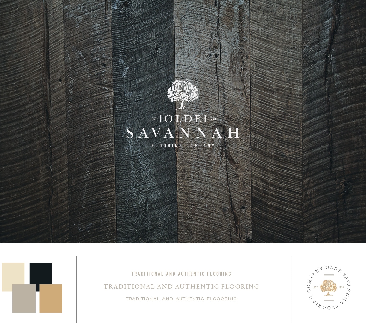
Olde Savannah Flooring
October 10, 2011
Olde Savannah Flooring is a custom wood flooring company out of Atlanta Georgia. Their hardwood floors are crafted by hand using European and old world techniques for distressing and finishing. Everything from floor patterns to color and finishing is completely custom and always executed to perfection. Their body of work was truly inspiring to us as we worked on their logo. We sought to capture their attention to detail in their new brand. We are in the process of re-designing their stationery package and website and look forward to sharing those with you soon.
Client: Olde Savannah Flooring
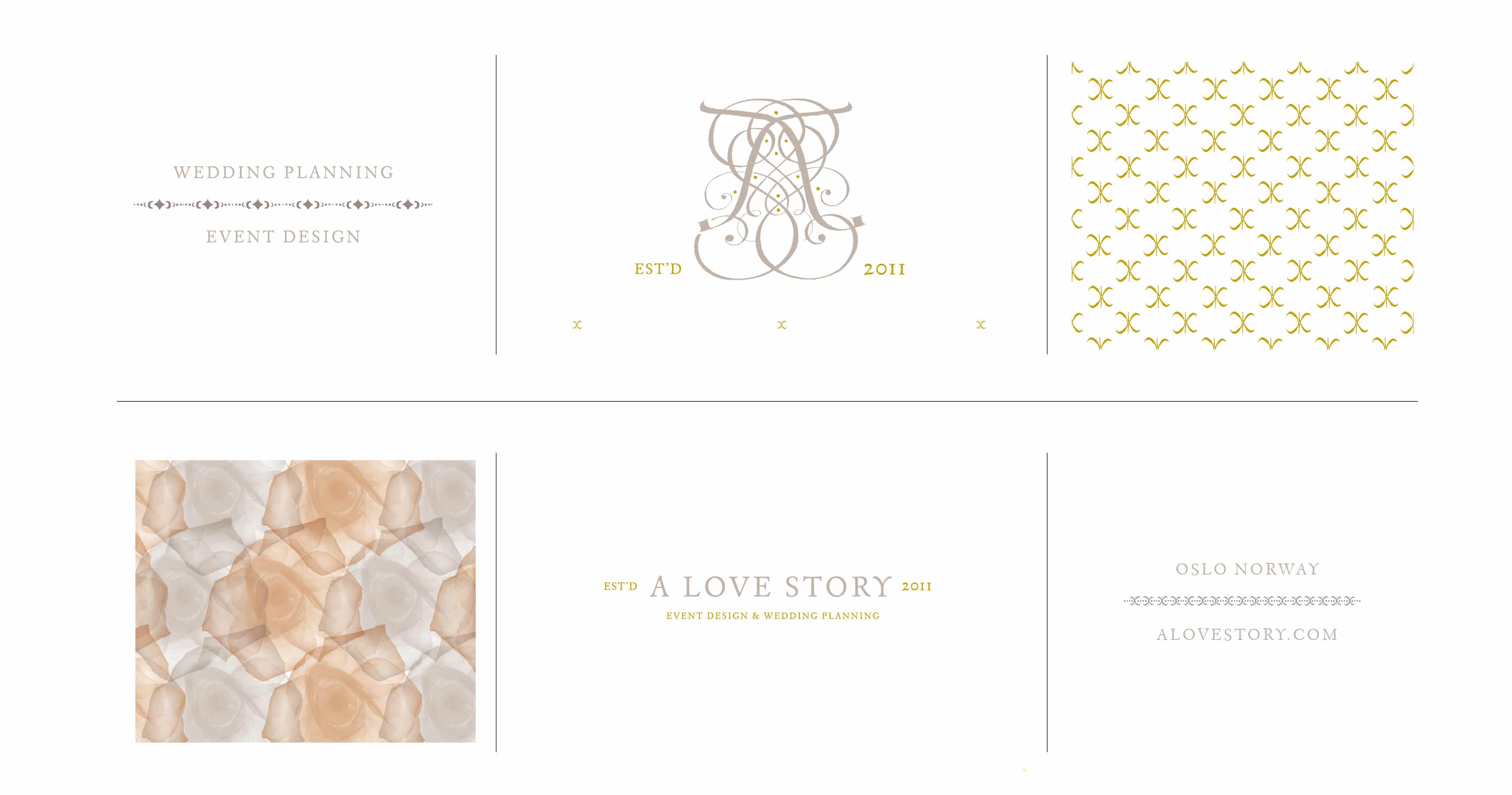
A Love Story
July 18, 2011
We just completed this logo and these graphic elements for A Love Story, a Norwegian based wedding planning and event design company. The logo is a combination of traditional calligraphy lines and elements that come together to form an abstract monogram. We’re in the process of designing the identity package and have been working on supporting graphic elements and patterns, also shown here. Read the rest of this entry »
Client: Linda Gram