Posts Tagged ‘Packaging Design’

Palermo Body

October 20, 2015

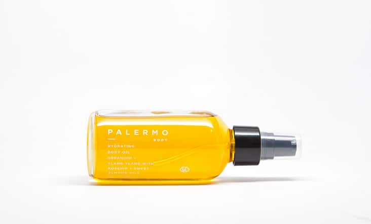
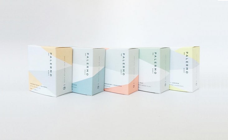
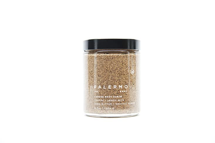
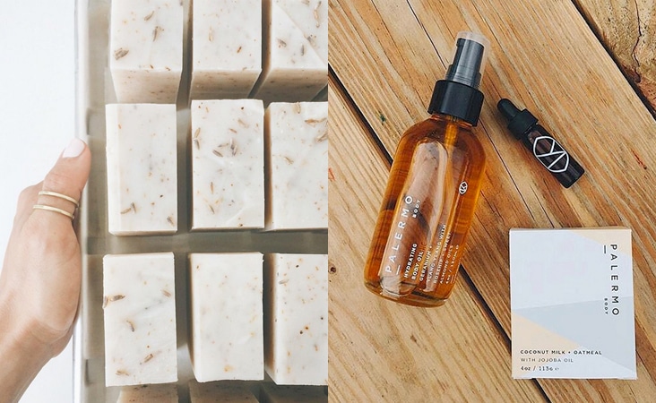
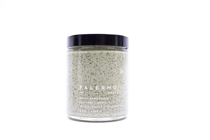
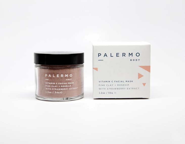
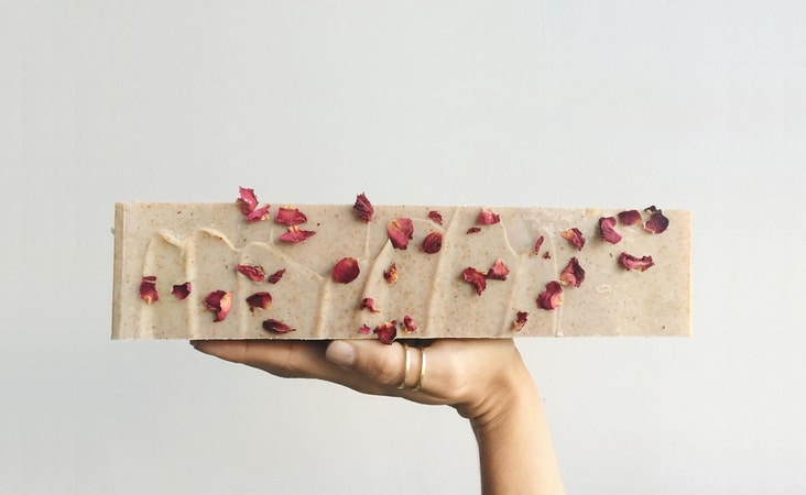
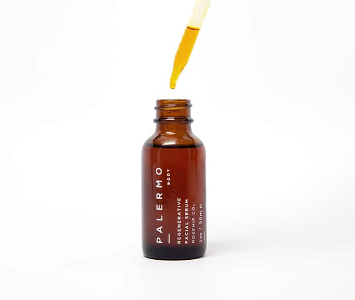
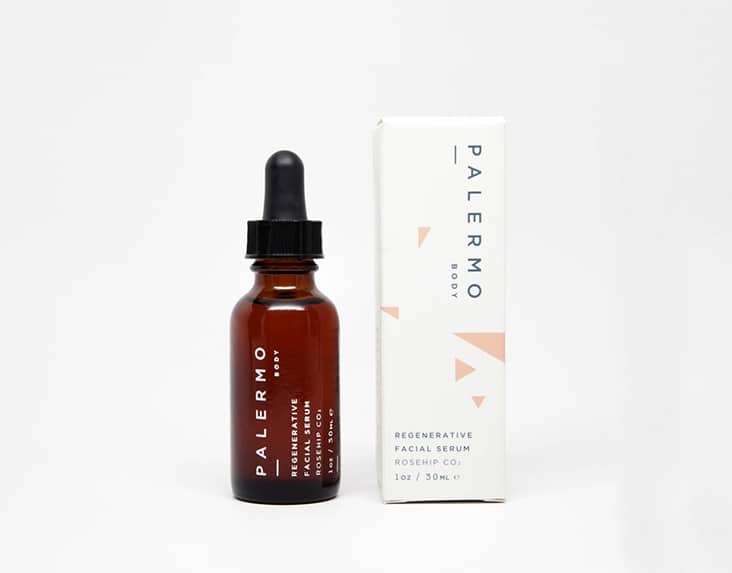
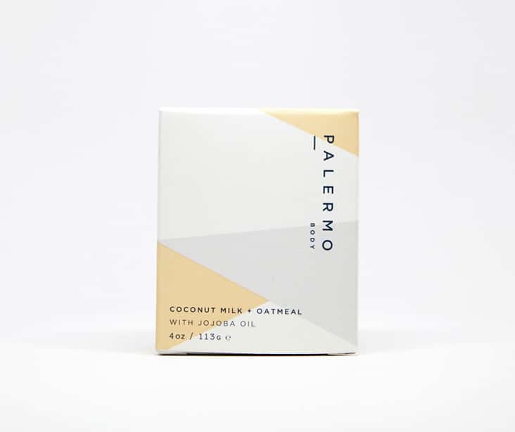
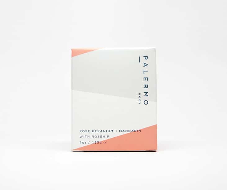
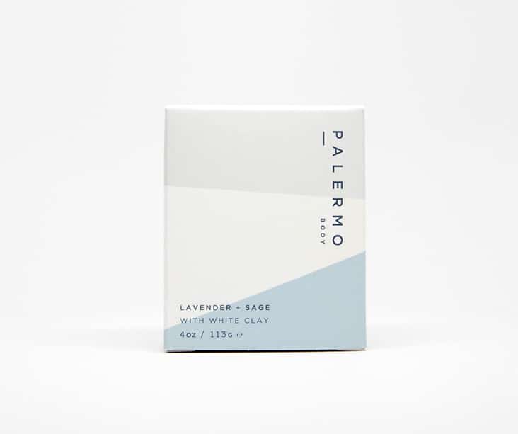
Palermo Body is a collection of natural skin care products made by hand in small batches by Jessica Morelli. Each product is consciously formulated by choosing every ingredient with purpose, and mindfulness of its benefits to your skin and effect on the environment.

We designed the brand and the packaging with that same philosophy in mind — with purpose and simplicity.

Client: Jessica Moreilli

Comments Closed   Tags: , , ,

The Pressery

April 2, 2015

Located on Magazine Street in New Orleans, The Pressery is a new restaurant and juice bar serving organic cold-pressed juice and fresh meals. A clean design aesthetic was utilized on all branded elements. From logo development to signage to packaging design – a simple and fresh approach was used to complement the cleansing juices and meals served daily.

Packaging Photography by Thao Tran

Client: Kim Nguyen

Produce Candles

March 3, 2014

We’re excited to share this new packaging for Produce Candles. Sweet, earthy, spicy, crisp… each element is seasonally represented in these hand-cultivated candles made with natural soy wax and premium cotton wicks. The candles are housed in silkscreened canning jars with patterns representing each scent. Applied on top of each jar is a front and back label printed two color and then embossed for that extra touch. The toppers are printed, laser die cut and then embossed. Each topper is secured with a custom colored rubber band (similar to those you see everyday in the produce section and farmers market). These clean, fresh candles bring the best of the farm stand into the home.

Client: Produce Candles

Garnish & Gather

September 4, 2013

Garnish & Gather is a new company out of Atlanta, Georgia founded around the idea of rediscovering the art of cooking with gourmet meal kits. They provide you with all the raw ingredients needed in exactly the right portions for a locally grown home cooked meal. We really enjoyed working on the project. From brand development to packaging to dinner conversation topic cards Read the rest of this entry »

Client: Garnish & Gather

Comments Closed   Tags: , , ,

Nonnavita – Super Natural Soap

August 29, 2013

The Nuns of the Monastery of St. Michael the Archangel came to us to help them refine their logo and packaging for their all natural soap, Nonnavita. The word Nonnavita is a combination of two latin words put together: nonna, meaning nun, and vita, meaning life:  A Nun’s Life. Read the rest of this entry »

Client: The Monastery of St. Michael the Archangel

Comments Closed   Tags: , , ,

Home Team BBQ

September 20, 2012

We have been working with Home Team BBQ for many years now. Recently, we updated their brand that we originally designed for them back in 2006. We kept the core elements of their brand, infused some new elements and expanded their logo family. With two locations and a cult following, we designed a few more elements that they could use on everything from menus to sauce packaging to merchandise. You can see some of that new branding at work on the sauce packaging we just completed for them. Read the rest of this entry »

Client: Home Team BBQ

Callie’s Biscuits New Packaging

March 22, 2012

Our favorite southern biscuits just got a new look! Carrie of Callie’s Biscuits came ti us looking for a way to elevate her made-by-hand biscuits on the shelf as well as find a way to quickly identify the different biscuit varieties the company has to offer. Each custom kraft box utilizes a small illustration that acts as the biscuit variety identifier. Kraft paper, classic type, and whimsical illustrations help to convey Carrie’s commitment to her hand-made process and quality of her ingredients. Read the rest of this entry »

Client: Callie's Charleston Biscuits

Rewined

November 3, 2011

Rewined Candles are smart, smell great and now have a brand new logo and packaging. These handsome candles are all natural soy wax candles poured into discarded wine bottles. They have a family of intoxicating scents which are all designed to mimic flavors and aromas you find in your favorite varietals of wines. Adam came to us looking to enhance his current packaging. We redesigned his logo using hand-drawn type and redesigned his kraft paper labels with simple typography and a layered labeling system. Each candle has a  “vintage and producer” label, allowing each candle to be signed and dated by the candle maker. A wood veneer wax topper sits on top of the candle to keep them clean and free of dust before use. Read the rest of this entry »

Client: Rewined Candles

Soyful Candle Co. Packaging

September 18, 2011

We’re excited to share this simple packaging solution for Soyful Candle Co. We designed these wraps to fit tightly around each of the three jar sizes and tea light containters. Care instructions, facts about soy wax and environmental information are graphically treated on the reverse side of each wrap. Read the rest of this entry »

Client: Soyful Candle Co.

Schermer Pecans Packaging

June 23, 2011

We’re excited to share these photos of the new Schermer Pecan packing. Photographer Jason Stemple shot these beautiful photos for Schermer last week. We hosted the shoot at our studio and acted as the stylist. We ate lots of yummy pecans and had fun trying out different utensils and antique items to accompany the pecans. We designed the packaging to be simple and uniform using a silkscreened cloth bag to add warmth and texture to the overall design.  Read the rest of this entry »

Client: Schermer Pecans

Comments Closed   Tags: , , ,